How and why you should conduct better user research in your projects
Introduction
Having worked on software development projects for a range of different clients and industries, I have frequently seen that user research is conducted poorly, or even not at all. In this piece, I conduct an in-depth analysis of how to conduct successful user research for your project, and why it is so important. This includes:
Guerrilla UX in a pandemic: encouraging best practices in adverse situations
Summary
Working as UX Designers, we can often be put into situations where clients are unaware of the value of UX practices, and we have to not only explain that value, but to also demonstrate it. In this portfolio piece, I describe how I worked remotely on a technically complex project during a pandemic, with no affordance made for discovery and research, how I helped the client understand the value of what I was doing, and worked tactically to demonstrate value beyond their expectations to make an outcome that everyone was proud of.
Brief
Working remotely as a consultancy team, I was part of a team brought in to improve our client’s bonds trading system
The systems worked on a “request for quotes” mechanism, simply described as:
A trader will offer up bonds for trading
Other traders will make “quotes”, offering trades for the bonds, which come back as tickets on the system
The initial trader can accept, decline, or adjust the amount and send it back to the other trader as a counter-offer
This process continues until the trade is agreed, in which case it is them submitted for the trade to be processed, or the trade is declined, and the process starts again.
Previously built using Flash, which was being deprecated at the end of that year, we were initially taken with “lifting and shifting” it to an HTML based solution, with my role providing user interface design support to the developers, creating design artefacts upon request.
During initial conversations, I found that the system had been modified continually beyond original remit since it was launched, slowing down the process and obscuring tickets, leading to experience rot.
This provided an opportunity to not only improve the development, but also review the design, finding ways to make the system address the needs of users, and help traders make trades more efficiently.
Research – initial explorations
As I had very little knowledge of bonds trading, I conducted a series of discussions with the Product Owner and Subject Matter Experts, as well as colleagues within Scott Logic to improve my understanding of the process
Through these discussions, I was able to build a simple user journey of the RFQ process, as described in the Brief above, which helped me to also identify assumptions to be challenged, as well as areas where problems might occur, and opportunities where we could improve things.
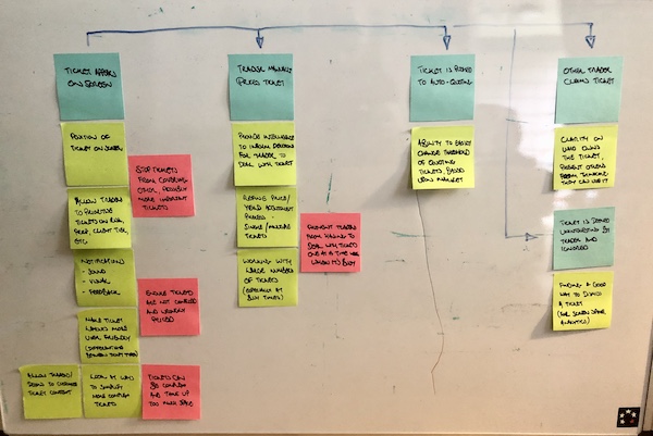
This is what my initial user journey looked like:
My initial explorations describing the stages of the RFQ process (blue), identifying problems and questions (red), as well as questions and opportunities (green)
Research – flexible interviews
Using what I had learned, I was able to convince the Product Owner to put me in contact with some actual Traders to conduct research with, so that I could understand their current experiences with the platform, as well as challenge my own assumptions
I managed to talk with 12 Traders, one from each trading desk, to understand the subtle differences in their requirements
As this took place during the pandemic, I had to conduct the research over video and audio calls, which, while they proved fruitful, were not as ideal as actually being able to oversee the Traders in situ, but I did not have the luxury of that option at the time.
One thing that I learned during my first few interviews was that the Traders were not able to stop trading during our sessions, and so would be frequently interrupted with loud noises and the need for them to break off our conversation and conduct a trade
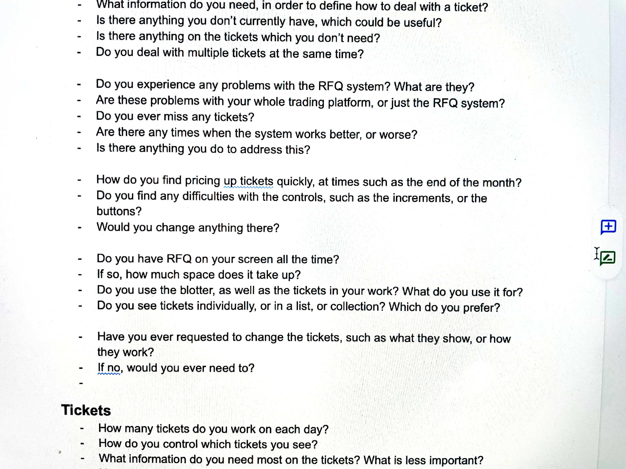
I therefore had to cut my questions up into sections, in order to try and anticipate these interruptions, and ensure that I got the information I needed before we lost the flow of conversation. You can see my interview script here, complete with the gaps every couple of questions:
A screenshot of part of my interview script, showing gaps between every 3-4 questions.
Research – discoveries
The key discoveries I made through my research:
In RFQ Bonds trading situation, reaction speed and accuracy is key towards making successful trades
The current situation had initially built as a “one size fits all” solutions, and then continually added to by requests from different desks to suit their differing needs.
This led to the platform suffering from experience rot – the system slowing down due to increased demands, and the traders missing important trades.
This also led to problems with the user interface, with the current system showing information in overlapping windows that obscured important information, employing bright colours and loud sounds to grab attention with no bearing on other parts of the interface, leaving to confusing and combative messaging.
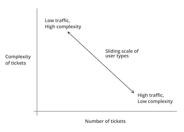
Each of the trading desks could be placed along a scale, with Traders at one end trading a high number of tickets per day, with less supporting information required to make trading decisions, and Traders at the other end performing fewer trades, but requiring more supporting information:
Graph showing the sliding scale of different user types, based upon complexity of tickets against “traffic” (number of tickets dealt with per day).
Demonstrating value through discovery
Following my research, the Product Owner was keen to see some visual progress of my work, and I wanted to demonstrate the value of what I had discovered.
Therefore, I made the decision to work on an Agile iterative wireframe approach, in order to have visual representations of early concepts, which I could then demonstrate to the Product Owner, Subject Matter Experts and Traders, in order to gain feedback.
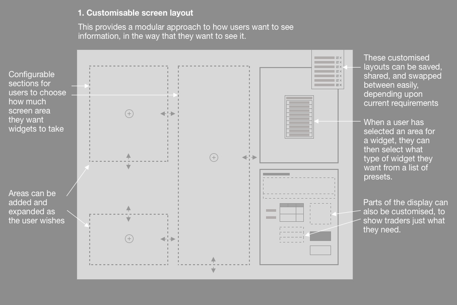
Customisable screen layout
A wireframe detailing how users can define what appears on each part of the screen, as well as save and share their layouts.
It was clear that the platform needed to present multiple tickets clearly to the traders, without overlapping each other, and that they needed to be able to amend their displays to show information that they found important.
The first step was to establish a customisable screen layout, where traders could build the layout that suited their needs, as well as save that layout, and share it with others (we found that Traders preferred to copy each other’s set-ups, rather than define their own).
Within each section, further customisation would be possible, so that traders could see just what they needed, and nothing else.
Working with tickets
Wireframe showing how multiple tickets can be stacked and displayed with more or less information
It was important that we gave Traders the ability to work with tickets in a way that suited their requirements, so we devised different approaches:
Showing larger tickets with more information
Displaying tickets stacked horizontally, so they could see the stream of incoming tickets, and work with multiple tickets at once
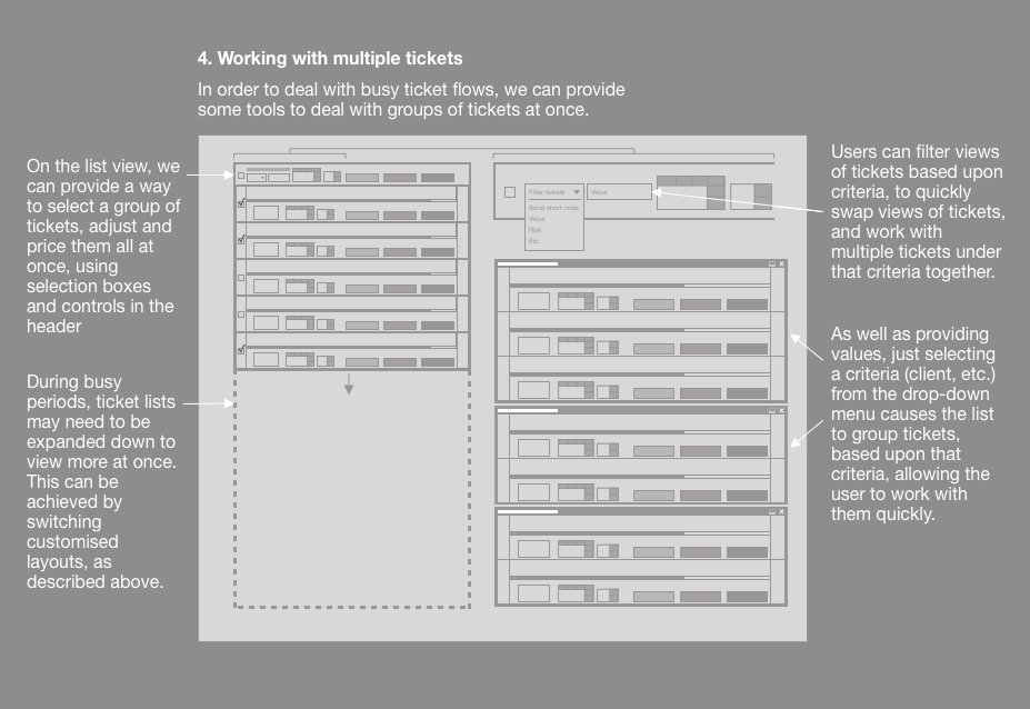
Traders could also set rules to have the system deal with tickets automatically, if they met certain criteria (such as everything below a certain value would be automatically declined), these could then be put into a “drawers” so that they are out of the way, but can be checked, if required.
This meant that Traders could “triage” tickets, to display the way that they wanted, and also could adjust these rules for different behaviours for busy periods, so that they weren’t overrun with tickets.
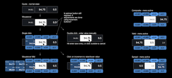
Numeric inputs
Mock-up showing a radial menu around an input field, allowing users to incrementally adjust values accurately.
As mentioned, speed is of the essence with RFQ trading, especially when countering by adjusting a quote and sending it back as a counter-offer.
We therefore needed to provide a way for traders to make quick, precise adjustments that they could be sure of, before sending them back.
We explored a number of options, and ended up settling on a radial “daisy wheel” approach, with buttons around the input box, allowing for rapid mouse changes, as well as mouse input.
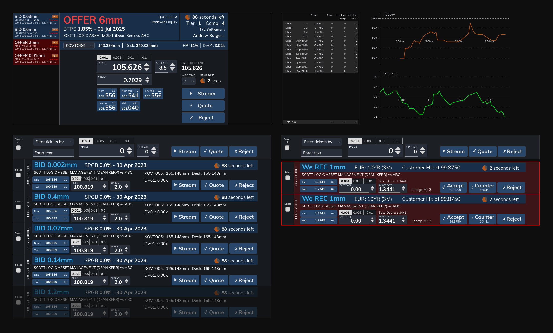
Pulling ideas together
High fidelity mock-up, showing just how large and small tickets fit together, as well as supporting analytics in the top right
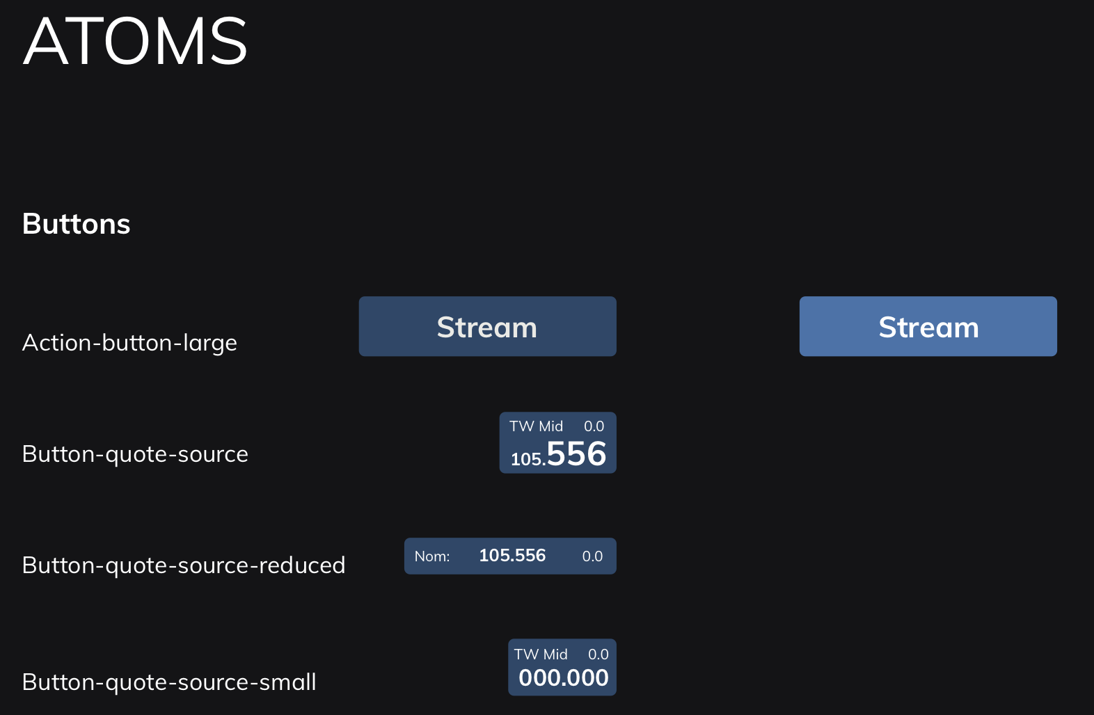
Atomic design system
The previous system was being continually added on to, leading to a confusion on messaging, information and alerts.
I therefore devised an atomic design system, which defined everything based upon a hierarchy:
Atoms (smallest possible items, such as buttons or labels)
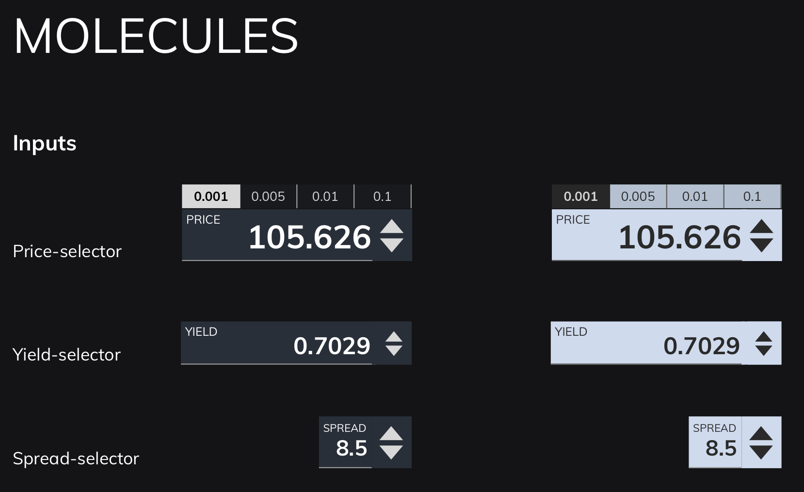
Molecules (combinations of atoms, such as an input form)
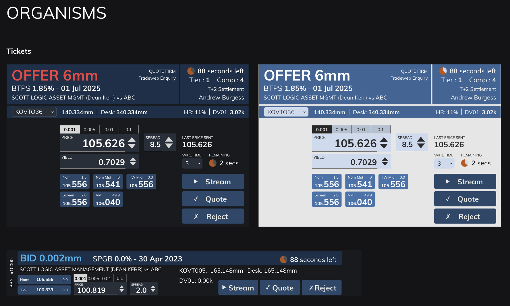
Organisms (groups of molecules, such as a ticket)
This helped to define onscreen colours, information and messaging that didn’t fight for the user’s attention, and helped them to focus on what was most important.
Due to the modular nature of the design system, this also helped the Development team to produce a modular component system using Storybook, meaning that quick changes to the master would cascade down to code that had already been implemented.
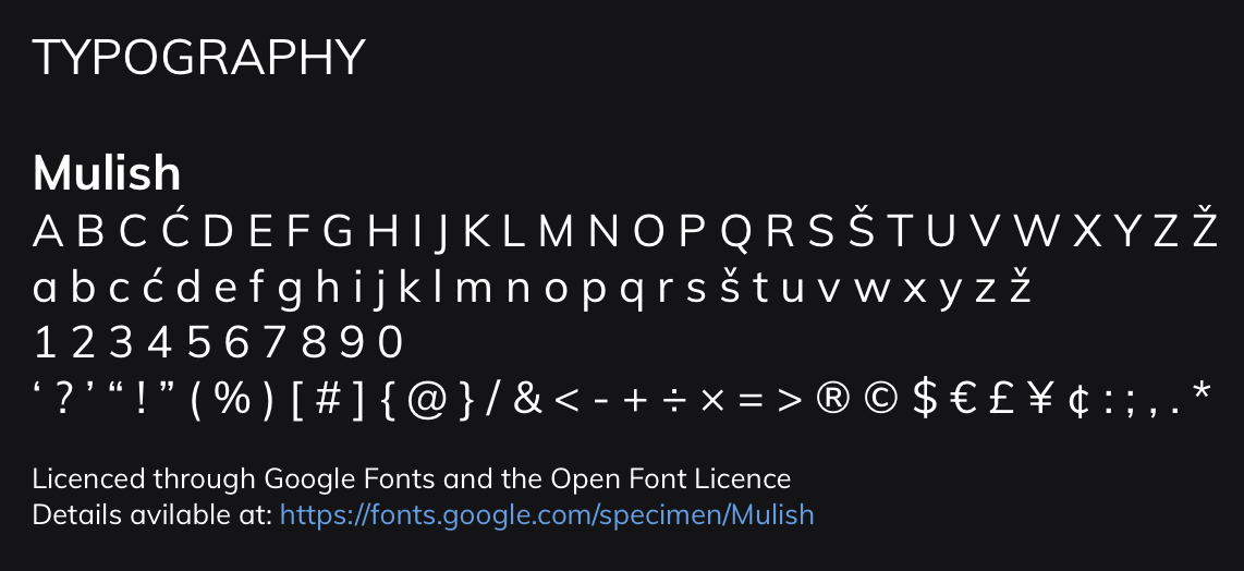
Design atoms – style guides for basic components such as buttons, text fields and inputs.Design molecules – providing style guidelines for combinations of atoms, such as price and yield selectors.Design organisms – style guidelines for combinations of molecules, such as different sizes of tickets.The Mulish font provided a clear sans-serif readability, while also providing slightly softer edges.
Conclusion
Despite the fact that the project wasn’t started with design thinking in mind, I was pleased to have been able to conduct research and a small degree of testing to demonstrate how we could make the trading system better by understanding the needs of the different trading desks, and designing to adapt the platform to their needs.
The initial engagement lasted three months, after which I was moved on to another project, only to be asked back again by the Product Owner, saying that it was important to have me on the project, as I was “the only Designer available who understood the context”.
The product has since been implemented, and reports have come back saying that Traders find it much more efficient and intuitive, leading to faster trades, and reduced stress during busy periods, both of which were objectives that I outlined during my research, and agreed with the client.
I was later asked to be part of a town hall interview at my consultancy, explaining the work that we did, and how we made it into a success. I also wrote an in-depth analysis of how and why you should conduct better user research in your projects, to help demonstrate to colleagues and clients why design should be considered at the start of the project, and how that can help to make highly successful outcomes.
If you’re interested in how I can help your complex project to be more successful, why not message me, and we can discuss your requirements?
How road safety measures show the value of revising your design work
Introduction
Having previously worked on projects where stakeholders had set a tight timeframe, and not allowed for any testing and iteration of the solution, I wanted to explore the concept of iterative design, and how it can benefit a project. I had learned as a child about the story of Percy Shaw, and how he had devised Catseyes, the reflective studs that illuminate the centre line of a road, inspired by the eyes of an actual cat reflecting his car’s headlights one evening. Using this example, I describe how Shaw didn’t just create his solution from that discovery, but went on to revise his design, test it, and incorporate new ideas until he produced the design that we know today. In the same way, projects can benefit from this approach, getting feedback on their designs, and ensuring that they suit user needs, before they are launched.
Sharing my experiences with job hunting in the UK tech industry
Introduction
On average, people in the UK tech industry change jobs every two years. Having had some experience myself of the difficulties around navigating the recruitment space, I thought I would provide some insights and tips around things I have found useful. These include details such as:
Defining your ideal job role, and what you want from it
Self promotion, including how to put together your CV and portfolio of work
Making applications to adverts, and keeping track of which applications you have and have not been successful in, and following up those you haven’t heard from
Tips around how best to present yourself at interviews, from screener calls through to face-to-face interviews
Preventing the loss of customers through improving user experience
Summary
How do you improve upon something which has already been built? In the summer of 2015, I was brought onto a project that sought to stem the loss of subscribers to their flagship scientific database, and devised a way of seeking out users, identifying key problems, and showing value to them by making it easier for them to find that they were looking for.
Introduction
The company I was working for, an internationally renowned scientific publisher, had evolved their main scientific database product from a series of books of data that they had been publishing since the early twentieth century. Their product was known as a reputable, if not expensive, source of data, which presented a problem for them – despite their reputation, they found that subscriptions to their product were decreasing, and they could not find out the reasons as to why.
Starting research, and finding users to talk to
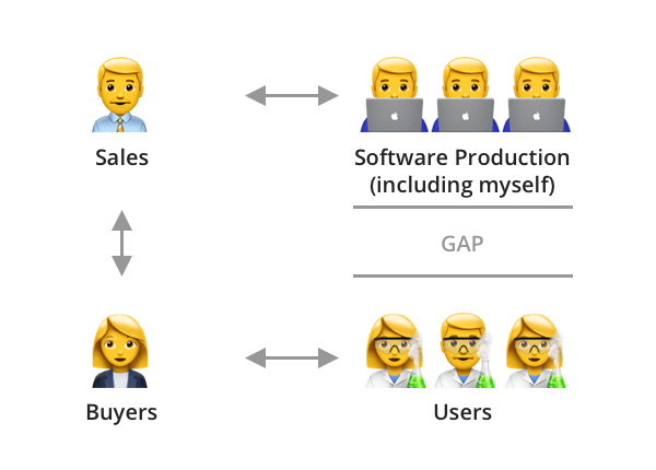
My initial attempts to understand the product were confounded by the fact that the company did not have access to the users. Their product was, in the main, purchased for an institution by a buyer, a librarian or facilities manager, who had control of the purse strings, but didn’t have much in-depth knowledge of the information provided in the database, meaning that my company’s salespeople could not get any feedback from them, or even manage to get details of any users with whom I could conduct research.
Diagram showing the relationship between my team and the users, and how it was difficult to get any users to conduct research with
The way I overcame this was to conduct my own campaign of finding users. I researched academic institutions and scientific companies who were our clients, found people who were responsible for the relevant sections, such as heads of departments, and wrote to them all, asking if they would be willing to provide people to help with my user research studies. As an incentive, I also managed to secure a supply of book vouchers, which could be given to participants, encouraging them to sign up (ironically, while younger participants were happy to receive the vouchers, many of the more established participants, such as tutors and professionals, were happy to take part just to help with improving the product). This campaign took some time, and, on average, I would have a positive response from roughly 1 in every 20 emails I sent, but, after some time, I began to build a stable of willing participants, with whom I could conduct research sessions.
The main aims of this research was to understand context, and so I asked a range of questions, starting with more basic ones, such as:
What do you do in your everyday work?
What challenges do you face in your work?
How does this database help you with this?
Is there anything that the database doesn’t have, but you would like to see?
I would then move on to more precise questions, understanding how they use the site, what kinds of information they are looking for, and even asking them to show me how they would go about trying to find a particular piece of information. This gave me a picture of the different types of user, what they were looking for, and how easily they found that information.
Improving user flows
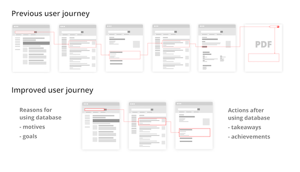
Given the information I had gained from the user research, I could then put together a picture of the “red routes” – key popular user flows through the site, and examine how easily they were found, and my examinations turned up some surprising results. It turned out that one key route to find a particular piece of information consisted of navigating through six different screens, and then having to download a PDF to find the relevant piece of data. Looking at the analytics for this path clearly indicated that at each of the six screens, users were becoming frustrated and leaving the site.
This was a clear indication of experience rot, contracted from the fact that the site had been continually added to over time, without consideration of overall scope, leading to a degradation of the user experience. What’s more, keeping the information on scanned PDFs, meaning that they weren’t machine-readable and could not be indexed, and the separation of the data on the PDF from the rest of the site often resulted in further loss of users, as they were not encouraged to engage with the site further.
In order to address this, I worked, not only to reduce the number of screens needed to locate a piece of data, but to also understand what users did before and after they came to use the database. Did they write the information down? Did they print it, or copy and paste it into another application? By knowing this, I could therefore understand not only what users were looking for, but how they were using that information, even after they had left the site, and therefore design the site to demonstrate value to them, encouraging more frequent interactions.
Comparing the old and new user journeys to find a single piece of information on the database, as well as dining an appreciation of what the user does before and after coming to the product.
Digitising data
To further improve the process of locating data, it was key to digitise the data found in the PDFs. This not only put the data on the actual site, reducing the chance of users navigating away from the site, but it also made it machine-readable, meaning that it could be found more easily in search. This process, however, was quite lengthy, as it involved much persuasion of stakeholders to invest resources in getting subject matter experts to go through the PDFs, enter the data in by hand, and contextualise it, so that it could be properly indexed within the site.
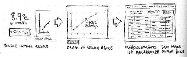
One useful benefit of making the data machine-readable was that it could also be used in modelling. I worked with the subject matter experts to design interactive pages, where users could map data onto a graph, and then adjust details to see changes, and focus in on the parts of the data that they found relevant. They could then download the graph and relevant data for use in experiments, presentations and writing papers.
Mock-up of the interactive page, showing how the user could search for information, have it plotted on the graph, and build a table of data beneath it for export
Using data to improve search
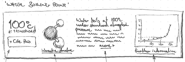
The machine readable data also provided us with an extra way to enhance the site, by opening the way to a richer search experience. Working with the developers, we were able to improve the way in which the search reviewed information, moving from the literal matching of words to understanding context around a piece of information (referred to as a “graph” search). This provided richer results, which I could then leverage further, by surfacing relevant data earlier – a search for water would not just provide a link to page on water, but might also provide information such as the boiling point for water, its chemical composition, and so on. This concept was inspired by the rich results that search engines such as Google and Wolfram Alpha provide, and helped to demonstrate further value to the user.
Sketch proposition of how the improved search results could surface valuable information, including basic information over boiling point, chemical composition, and links to the graph functionality to discover more.Sketch proposition of the improved user journey, from simple data to graph manipulation and selection, resulting in a data table of data that is relevant to the user
Homepage improvements
Our final step in improvements to the database was to provide signposting to users, both new and old, of ways in which the site had improved, as well as encouraging them to try some of the new ways of finding information and explore the new site architecture. We therefore redesigned the page to provide lists of content, recent updates, and showcases of specific items, so that any visitor to the site could quickly discover the resources and tools offered by the database, as well as appreciate the enhanced user experienced and increased value.
Testing and outcomes
Throughout our process, we engaged in user testing, to facilitate the “build, measure, learn” strategy, allowing us to continually test and iterate upon ideas throughout production. Towards the end of production, we took the product with us to various scientific conferences on the East coast of the United States, where we showcased key features and conducted guerrilla testing on a booth with passers-by. The people we talked to were highly impressed, and this was reflected when we began to roll it out – customer attrition was reduced, subscriptions began to rise, and licenses for the product were even purchased by the Indian government for libraries across the entire country. The product was an awarded a “best in class” tool from the American Chemistry Society, and in surveys of users, 69.2% classified the product as “great”, an increase of 22% from when I started.
Conclusion
Due to the 2-3 years I spent on this project, I was able to make a lot of significant improvements, and effect changes which benefitted from continuous work with stakeholders, developers and subject matter experts. This allowed a methodical approach to improving the site, which I would have not been able to achieve on a shorter engagement. Overall, I’m pleased to have changed the product into a firm foundation that others can build upon, and help to further improve.
For many years, I have been using my website, SableIndustries, to represent the work that I do. However, in recent years, it has been in need of an update. This piece takes you through the process I followed in order to ensure that the website echoed the design thinking that I have learned in my work, as well as the work itself. Continue reading →
User Experience Design, or UXD for short, is described in its Wikipedia entry as “the process of enhancing user satisfaction with a product by improving the usability, accessibility, and pleasure provided in the interaction with the product”. Whilst this is a sufficient summary to explain UXD in a brief way, I wanted to take the chance to explain more about User Experience Design, how I view it, how it works for me, and what how I feel it can be beneficial, not just to me, but for companies that put the user at the centre of what they do. Continue reading →
My name is Andrew Robert Burgess, or Andy for short. I’m a User Experience Lead, having worked previously as a Graphic and Digital Designer, and a Front End Developer since I started my career in 1999. This has helped me get a really good understanding of not just the processes which go towards creating a great user experience for the product or service on which I am working, but also experience and knowledge of how best to work with production teams, and knowing what is required to fully optimise that product or service to give the best message and representation. Continue reading →
Perhaps the problem isn’t the phone, but the way in which it interacts with you?
Introduction
Another day, another article providing a soul-searching insight into why quitting smartphones is the new quitting smoking. These articles seem to occur regularly in the media these days, with accounts of people who feel trapped by their overuse of their phones, how they feel that their digital life is impinging on their real life, with their phones turning into monsters that continually buzz at them with notifications. These articles end up preaching solutions such as digital detoxes, phone stacking in restaurants, and have quotes from people saying how much better they feel when they don’t have their phones switched on, or even with them.
For me, the problem doesn’t lie with the way we interact with our phones, it’s about how our phones interact with us. When the web giants such as a Facebook, Google and Amazon began to realise just how much money could be made by advertising, they not only cashed in, but began to manipulate their properties so that they could multiply their efforts. The way that this was achieved was by factoring in design and functionality that encouraged compulsive behaviour. You may have heard of the “slot machine” effect of the Facebook newsfeed, encouraging you to pull down and refresh to refresh your newsfeed and get that dopamine hit of new content, or feedback on your contributions (in the interests of fairness, this isn’t actually exclusive to Facebook, many other apps have the same action, with similar effects). Many sites and apps use patterns to encourage further participation, and to keep the user on their product, and, whether intentionally malicious or not, some of these can evolve into dark patterns.
One such dark pattern that’s prevalent on almost every mobile device I know of are notifications. Even if, like me, you’re very stringent on keeping notifications on your phone to a minimum, whenever you download a new app the assumption is that the app can, unless you tell it otherwise, make noises, put messages on your lock screen and show banners whenever it wants to. In order to curtail this, you have to go into your settings and specify what notifications you receive. Apple and Google have made this easier to access in recent years, but it’s still an opt-out process, rather than an opt-in one, and for good reason – app makers want your attention on their products, and so want this way of bombarding you with information regularly, in the hope that you will give in, click on the link, and buy the product. Chances are, you’re probably not quite as hardcore with your notifications, so just imagine how fewer ones you would receive if you could choose to opt-in, rather than have to make the effort to opt-out?
Chances are, companies such as Facebook and Google aren’t going to go away, and they will certainly be around longer than the time you decide to go on your digital detox and later decide to rejoin the connected world, and, what’s more, you can be pretty sure that a lot of your friends are still going to be using them. However, there is a rising tide of interest in how these companies conduct themselves; we’ve seen questions into fake news, how they structure content on your timeline, and whether they should be responsible for the media that appears on their platforms. In my view, we should be asking these companies to not only look at the content they provide, but also the way they provide it. They should work out what their relationship with their users are, and how that they can provide advertising and updates in a more conscientious way. These companies aren’t the only problem, but if we could get them to change and show the benefits of doing so, others may follow suit. Through better notification design, we could learn to love our phones once again.
How putting yourself in the mindset of a stressed person might just save lives
Introduction
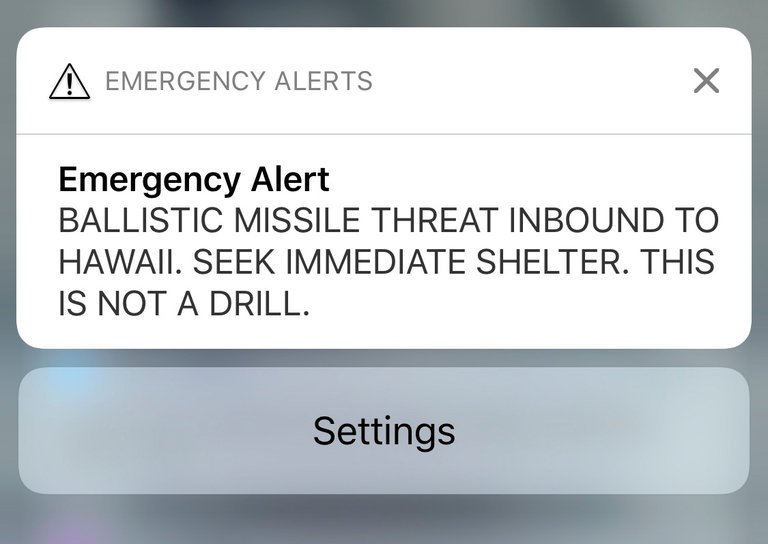
On Saturday 13th January 2018, residents of the US State of Hawaii received an alert on their phones. Instead of a text from their relatives, or the latest football scores, the alert gave the ominous message of “BALLISTIC MISSILE THREAT INBOUND TO HAWAII. SEEK IMMEDIATE SHELTER. THIS IS NOT A DRILL”. In an environment of the realistic threat of nuclear war indicated by the US President’s tweets, alongside the continual goading and threats put out by North Korea on their state television networks, the announcement was met with derision, confusion, and overall, undue widespread panic. It turned out later, following a second message indicating that the first one was a “false alarm”, caused by an employee during a shift change at the Hawaii Emergency Management Agency, who intended to send out a “test” message, instead of a “live” one. This resulted in a public apology from the Governor of the state, and much embarrassment amongst those responsible.
Much has been said in the days that followed the incident about the way in which such a mistake could have been made. Aside from the general panic, it has the extra element of “cry wolf”, where, if the alert is sent out again, those receiving it will now view it with a level of skepticism, instead of immediately acting upon the advice – something which is crucial in the estimated 20 minutes that it would take for a nuclear missile to reach Hawaii from North Korea.
Aside from the social or political elements of this situation, it also raises some questions around the design of the system built to send out these alerts, and how to ensure that users can ensure that the intended drill of “test” or “live” messages are being run. Two luminaries of the design world, Don Norman, author of Design of Everyday Things, and Jared Spool, founder of UIE and the Center Centre have both written insightful pieces on their views of what went wrong, and how it can be prevented in future by the use of better design principles. Writing on Co.Design, Norman’s piece focusses on the fact that we like to blame people, rather than poor design and that the system should have been thoroughly tested before it went live. Spool’s piece on Medium focusses on the fact that the system incorporated poorly chosen file names, as well as poorly designed software.
Both pieces come to a similar, and vital conclusion. When we design and build a system, we should always consider the possibility of what it will be like for someone to use it under stressful conditions. We may not ever come to the point of designing alert mechanisms for incoming nuclear missiles, but we should still consider how easy our webpage, app or system might be to use if the user is pushed by a tight deadline, for example, or is being distracted in some way. Interestingly, my workplace at this very moment, is incurring stress upon my colleagues and I, as work is being done on the roof, and we are frequently subjected to loud bangs, or the sound of hammering and drilling. These interruptions frequently distract us from what we’re doing, causing us to lose focus on where we were with our work, and having to spend time reacquainting ourselves with the task at hand. In this situation, it is common for us to make mistakes as our brains make incorrect assumptions, and we then have to realise those mistakes, and correct them.
So, how do we design for these stressful situations? Thankfully, much of this is already incorporated into the skills we learn in User Experience Design. Giving structure to pages and forms, giving visual dominance to important elements, and clearly labelling and colouring key features can help the brain realise what needs to be done more quickly. We also need to consider what the implications would be if a user made a mistake. How easy would it be to choose the wrong thing? Can an error be easily rectified? Does the system indicate clearly the user’s selections, so that they can go back and fix it later? We can even test these things ourselves – take a prototype or a test version of the system, and go and sit in a busy or noisy environment and ask people to try it. Compare this with people in a quiet, calm place, and see if there is a difference in successful outcomes. The more we trial the system or software, the more sure we can be of its success. We can say that good design and testing can improve revenue or experience, but some day, in the case of the Hawaii Missile Alert, it might just save our lives.