Preventing the loss of customers through improving user experience
Summary
How do you improve upon something which has already been built? In the summer of 2015, I was brought onto a project that sought to stem the loss of subscribers to their flagship scientific database, and devised a way of seeking out users, identifying key problems, and showing value to them by making it easier for them to find that they were looking for.
Introduction
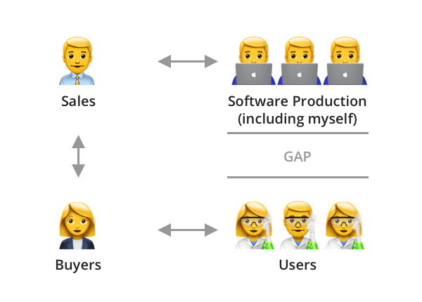
The company I was working for, an internationally renowned scientific publisher, had evolved their main scientific database product from a series of books of data that they had been publishing since the early twentieth century. Their product was known as a reputable, if not expensive, source of data, which presented a problem for them – despite their reputation, they found that subscriptions to their product were decreasing, and they could not find out the reasons as to why.
Starting research, and finding users to talk to
My initial attempts to understand the product were confounded by the fact that the company did not have access to the users. Their product was, in the main, purchased for an institution by a buyer, a librarian or facilities manager, who had control of the purse strings, but didn’t have much in-depth knowledge of the information provided in the database, meaning that my company’s salespeople could not get any feedback from them, or even manage to get details of any users with whom I could conduct research.
The way I overcame this was to conduct my own campaign of finding users. I researched academic institutions and scientific companies who were our clients, found people who were responsible for the relevant sections, such as heads of departments, and wrote to them all, asking if they would be willing to provide people to help with my user research studies. As an incentive, I also managed to secure a supply of book vouchers, which could be given to participants, encouraging them to sign up (ironically, while younger participants were happy to receive the vouchers, many of the more established participants, such as tutors and professionals, were happy to take part just to help with improving the product). This campaign took some time, and, on average, I would have a positive response from roughly 1 in every 20 emails I sent, but, after some time, I began to build a stable of willing participants, with whom I could conduct research sessions.
The main aims of this research was to understand context, and so I asked a range of questions, starting with more basic ones, such as:
- What do you do in your everyday work?
- What challenges do you face in your work?
- How does this database help you with this?
- Is there anything that the database doesn’t have, but you would like to see?
I would then move on to more precise questions, understanding how they use the site, what kinds of information they are looking for, and even asking them to show me how they would go about trying to find a particular piece of information. This gave me a picture of the different types of user, what they were looking for, and how easily they found that information.
Improving user flows
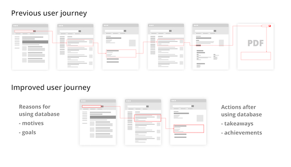
Given the information I had gained from the user research, I could then put together a picture of the “red routes” – key popular user flows through the site, and examine how easily they were found, and my examinations turned up some surprising results. It turned out that one key route to find a particular piece of information consisted of navigating through six different screens, and then having to download a PDF to find the relevant piece of data. Looking at the analytics for this path clearly indicated that at each of the six screens, users were becoming frustrated and leaving the site.
This was a clear indication of experience rot, contracted from the fact that the site had been continually added to over time, without consideration of overall scope, leading to a degradation of the user experience. What’s more, keeping the information on scanned PDFs, meaning that they weren’t machine-readable and could not be indexed, and the separation of the data on the PDF from the rest of the site often resulted in further loss of users, as they were not encouraged to engage with the site further.
In order to address this, I worked, not only to reduce the number of screens needed to locate a piece of data, but to also understand what users did before and after they came to use the database. Did they write the information down? Did they print it, or copy and paste it into another application? By knowing this, I could therefore understand not only what users were looking for, but how they were using that information, even after they had left the site, and therefore design the site to demonstrate value to them, encouraging more frequent interactions.
Digitising data
To further improve the process of locating data, it was key to digitise the data found in the PDFs. This not only put the data on the actual site, reducing the chance of users navigating away from the site, but it also made it machine-readable, meaning that it could be found more easily in search. This process, however, was quite lengthy, as it involved much persuasion of stakeholders to invest resources in getting subject matter experts to go through the PDFs, enter the data in by hand, and contextualise it, so that it could be properly indexed within the site.
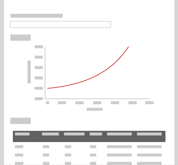
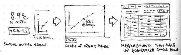
One useful benefit of making the data machine-readable was that it could also be used in modelling. I worked with the subject matter experts to design interactive pages, where users could map data onto a graph, and then adjust details to see changes, and focus in on the parts of the data that they found relevant. They could then download the graph and relevant data for use in experiments, presentations and writing papers.
Using data to improve search
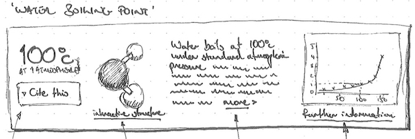
The machine readable data also provided us with an extra way to enhance the site, by opening the way to a richer search experience. Working with the developers, we were able to improve the way in which the search reviewed information, moving from the literal matching of words to understanding context around a piece of information (referred to as a “graph” search). This provided richer results, which I could then leverage further, by surfacing relevant data earlier – a search for water would not just provide a link to page on water, but might also provide information such as the boiling point for water, its chemical composition, and so on. This concept was inspired by the rich results that search engines such as Google and Wolfram Alpha provide, and helped to demonstrate further value to the user.
Homepage improvements
Our final step in improvements to the database was to provide signposting to users, both new and old, of ways in which the site had improved, as well as encouraging them to try some of the new ways of finding information and explore the new site architecture. We therefore redesigned the page to provide lists of content, recent updates, and showcases of specific items, so that any visitor to the site could quickly discover the resources and tools offered by the database, as well as appreciate the enhanced user experienced and increased value.
Testing and outcomes
Throughout our process, we engaged in user testing, to facilitate the “build, measure, learn” strategy, allowing us to continually test and iterate upon ideas throughout production. Towards the end of production, we took the product with us to various scientific conferences on the East coast of the United States, where we showcased key features and conducted guerrilla testing on a booth with passers-by. The people we talked to were highly impressed, and this was reflected when we began to roll it out – customer attrition was reduced, subscriptions began to rise, and licenses for the product were even purchased by the Indian government for libraries across the entire country. The product was an awarded a “best in class” tool from the American Chemistry Society, and in surveys of users, 69.2% classified the product as “great”, an increase of 22% from when I started.
Conclusion
Due to the 2-3 years I spent on this project, I was able to make a lot of significant improvements, and effect changes which benefitted from continuous work with stakeholders, developers and subject matter experts. This allowed a methodical approach to improving the site, which I would have not been able to achieve on a shorter engagement. Overall, I’m pleased to have changed the product into a firm foundation that others can build upon, and help to further improve.