Guerrilla UX in a pandemic: encouraging best practices in adverse situations
Summary
Working as UX Designers, we can often be put into situations where clients are unaware of the value of UX practices, and we have to not only explain that value, but to also demonstrate it. In this portfolio piece, I describe how I worked remotely on a technically complex project during a pandemic, with no affordance made for discovery and research, how I helped the client understand the value of what I was doing, and worked tactically to demonstrate value beyond their expectations to make an outcome that everyone was proud of.
Brief
- Working remotely as a consultancy team, I was part of a team brought in to improve our client’s bonds trading system
- The systems worked on a “request for quotes” mechanism, simply described as:
- A trader will offer up bonds for trading
- Other traders will make “quotes”, offering trades for the bonds, which come back as tickets on the system
- The initial trader can accept, decline, or adjust the amount and send it back to the other trader as a counter-offer
- This process continues until the trade is agreed, in which case it is them submitted for the trade to be processed, or the trade is declined, and the process starts again.
- Previously built using Flash, which was being deprecated at the end of that year, we were initially taken with “lifting and shifting” it to an HTML based solution, with my role providing user interface design support to the developers, creating design artefacts upon request.
- During initial conversations, I found that the system had been modified continually beyond original remit since it was launched, slowing down the process and obscuring tickets, leading to experience rot.
- This provided an opportunity to not only improve the development, but also review the design, finding ways to make the system address the needs of users, and help traders make trades more efficiently.
Research – initial explorations
- As I had very little knowledge of bonds trading, I conducted a series of discussions with the Product Owner and Subject Matter Experts, as well as colleagues within Scott Logic to improve my understanding of the process
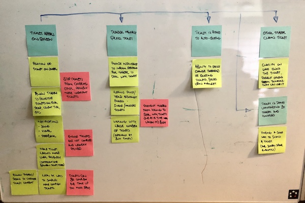
- Through these discussions, I was able to build a simple user journey of the RFQ process, as described in the Brief above, which helped me to also identify assumptions to be challenged, as well as areas where problems might occur, and opportunities where we could improve things.
- This is what my initial user journey looked like:
Research – flexible interviews
- Using what I had learned, I was able to convince the Product Owner to put me in contact with some actual Traders to conduct research with, so that I could understand their current experiences with the platform, as well as challenge my own assumptions
- I managed to talk with 12 Traders, one from each trading desk, to understand the subtle differences in their requirements
- As this took place during the pandemic, I had to conduct the research over video and audio calls, which, while they proved fruitful, were not as ideal as actually being able to oversee the Traders in situ, but I did not have the luxury of that option at the time.
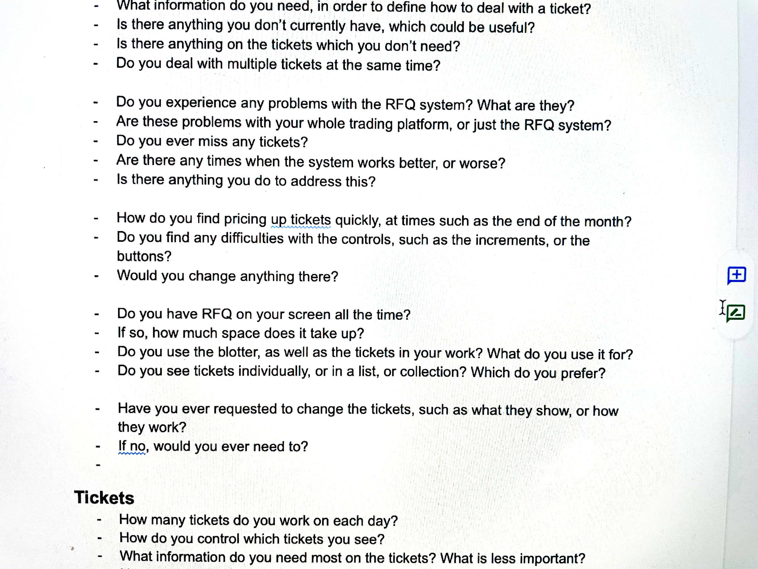
- One thing that I learned during my first few interviews was that the Traders were not able to stop trading during our sessions, and so would be frequently interrupted with loud noises and the need for them to break off our conversation and conduct a trade
- I therefore had to cut my questions up into sections, in order to try and anticipate these interruptions, and ensure that I got the information I needed before we lost the flow of conversation. You can see my interview script here, complete with the gaps every couple of questions:
Research – discoveries
The key discoveries I made through my research:
- In RFQ Bonds trading situation, reaction speed and accuracy is key towards making successful trades
- The current situation had initially built as a “one size fits all” solutions, and then continually added to by requests from different desks to suit their differing needs.
- This led to the platform suffering from experience rot – the system slowing down due to increased demands, and the traders missing important trades.
- This also led to problems with the user interface, with the current system showing information in overlapping windows that obscured important information, employing bright colours and loud sounds to grab attention with no bearing on other parts of the interface, leaving to confusing and combative messaging.
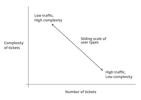
- Each of the trading desks could be placed along a scale, with Traders at one end trading a high number of tickets per day, with less supporting information required to make trading decisions, and Traders at the other end performing fewer trades, but requiring more supporting information:
Demonstrating value through discovery
- Following my research, the Product Owner was keen to see some visual progress of my work, and I wanted to demonstrate the value of what I had discovered.
- Therefore, I made the decision to work on an Agile iterative wireframe approach, in order to have visual representations of early concepts, which I could then demonstrate to the Product Owner, Subject Matter Experts and Traders, in order to gain feedback.
Customisable screen layout
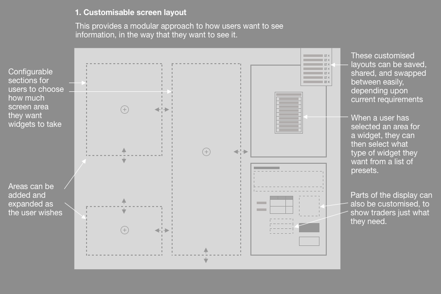
- It was clear that the platform needed to present multiple tickets clearly to the traders, without overlapping each other, and that they needed to be able to amend their displays to show information that they found important.
- The first step was to establish a customisable screen layout, where traders could build the layout that suited their needs, as well as save that layout, and share it with others (we found that Traders preferred to copy each other’s set-ups, rather than define their own).
- Within each section, further customisation would be possible, so that traders could see just what they needed, and nothing else.
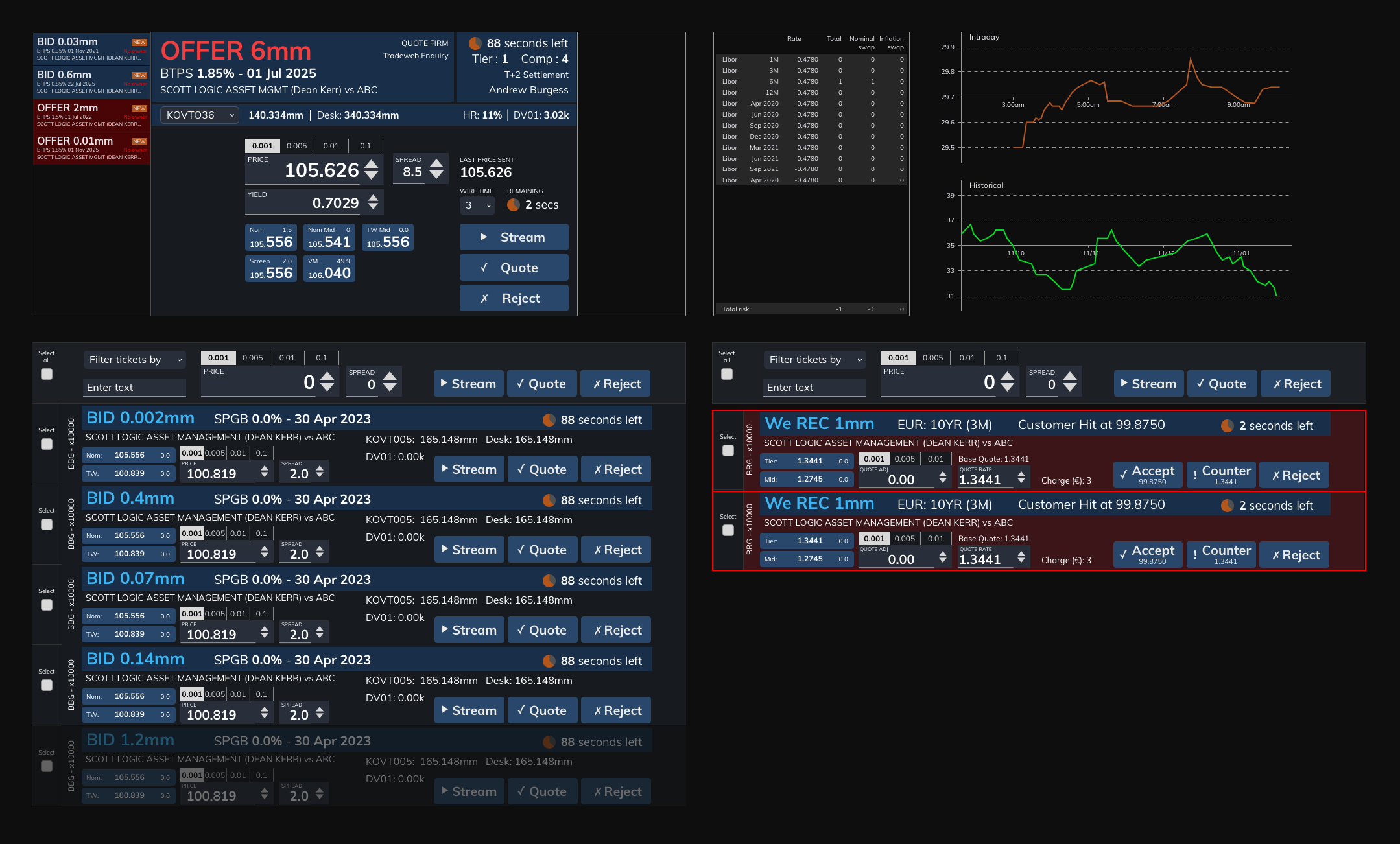
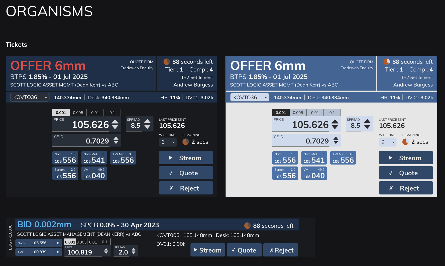
Working with tickets
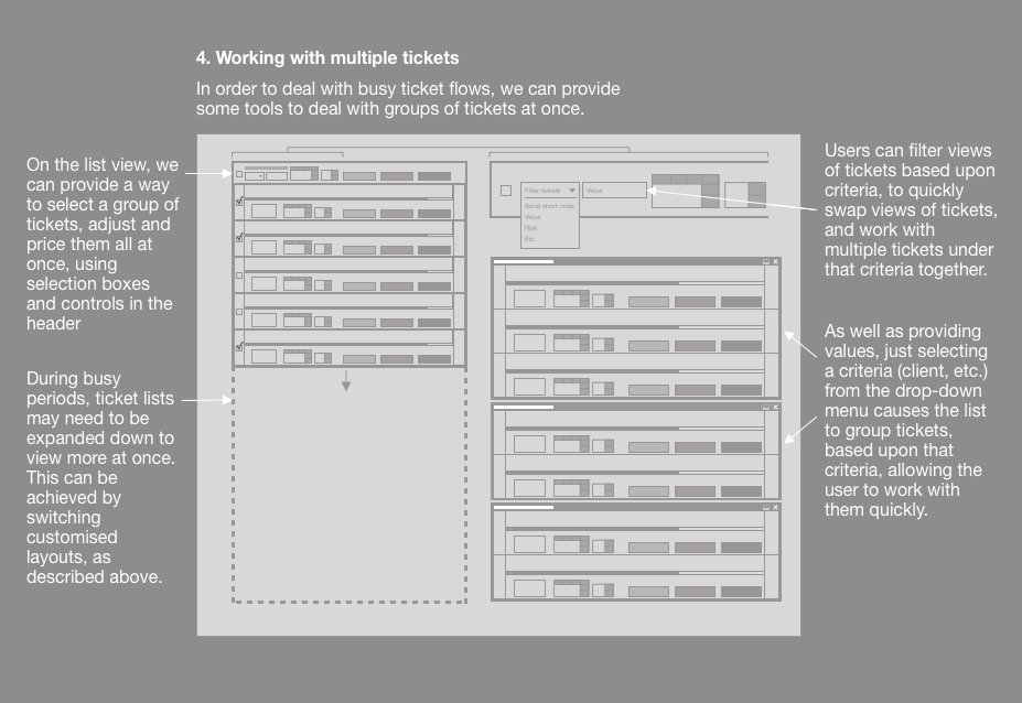
- It was important that we gave Traders the ability to work with tickets in a way that suited their requirements, so we devised different approaches:
- Showing larger tickets with more information
- Displaying tickets stacked horizontally, so they could see the stream of incoming tickets, and work with multiple tickets at once
- Traders could also set rules to have the system deal with tickets automatically, if they met certain criteria (such as everything below a certain value would be automatically declined), these could then be put into a “drawers” so that they are out of the way, but can be checked, if required.
- This meant that Traders could “triage” tickets, to display the way that they wanted, and also could adjust these rules for different behaviours for busy periods, so that they weren’t overrun with tickets.
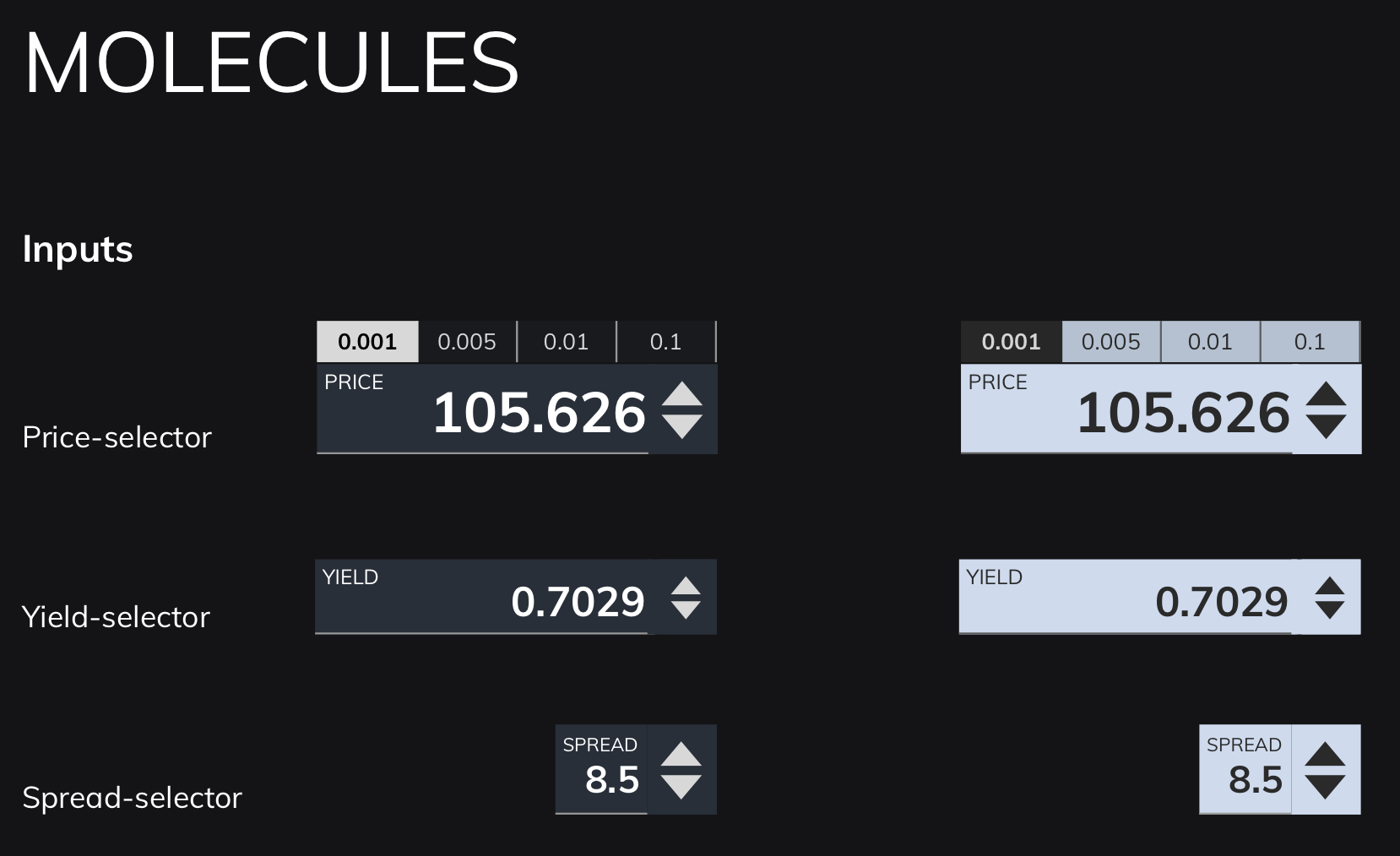
Numeric inputs
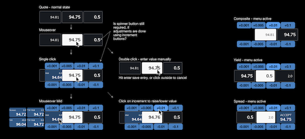
- As mentioned, speed is of the essence with RFQ trading, especially when countering by adjusting a quote and sending it back as a counter-offer.
- We therefore needed to provide a way for traders to make quick, precise adjustments that they could be sure of, before sending them back.
- We explored a number of options, and ended up settling on a radial “daisy wheel” approach, with buttons around the input box, allowing for rapid mouse changes, as well as mouse input.
Pulling ideas together
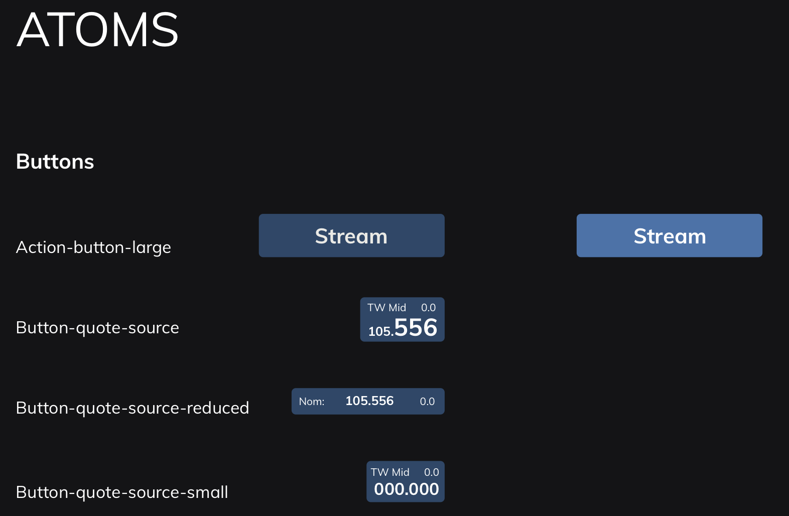
Atomic design system
- The previous system was being continually added on to, leading to a confusion on messaging, information and alerts.
- I therefore devised an atomic design system, which defined everything based upon a hierarchy:
- Atoms (smallest possible items, such as buttons or labels)
- Molecules (combinations of atoms, such as an input form)
- Organisms (groups of molecules, such as a ticket)
- This helped to define onscreen colours, information and messaging that didn’t fight for the user’s attention, and helped them to focus on what was most important.
- Due to the modular nature of the design system, this also helped the Development team to produce a modular component system using Storybook, meaning that quick changes to the master would cascade down to code that had already been implemented.
Conclusion
- Despite the fact that the project wasn’t started with design thinking in mind, I was pleased to have been able to conduct research and a small degree of testing to demonstrate how we could make the trading system better by understanding the needs of the different trading desks, and designing to adapt the platform to their needs.
- The initial engagement lasted three months, after which I was moved on to another project, only to be asked back again by the Product Owner, saying that it was important to have me on the project, as I was “the only Designer available who understood the context”.
- The product has since been implemented, and reports have come back saying that Traders find it much more efficient and intuitive, leading to faster trades, and reduced stress during busy periods, both of which were objectives that I outlined during my research, and agreed with the client.
- I was later asked to be part of a town hall interview at my consultancy, explaining the work that we did, and how we made it into a success. I also wrote an in-depth analysis of how and why you should conduct better user research in your projects, to help demonstrate to colleagues and clients why design should be considered at the start of the project, and how that can help to make highly successful outcomes.
If you’re interested in how I can help your complex project to be more successful, why not message me, and we can discuss your requirements?