Designing for stressful situations

How putting yourself in the mindset of a stressed person might just save lives

Introduction

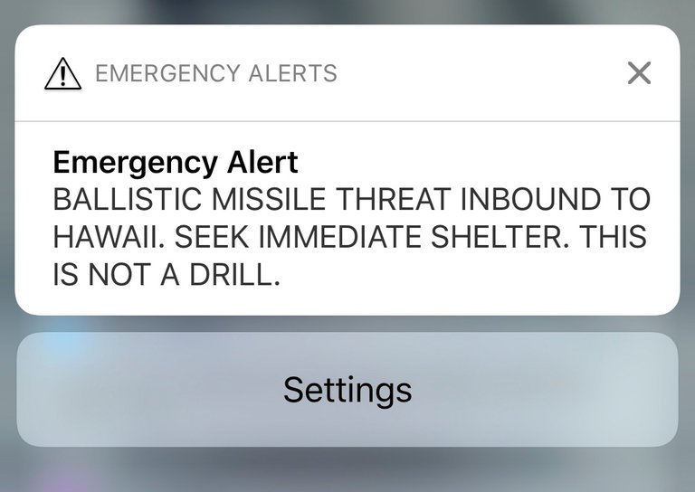
On Saturday 13th January 2018, residents of the US State of Hawaii received an alert on their phones. Instead of a text from their relatives, or the latest football scores, the alert gave the ominous message of “BALLISTIC MISSILE THREAT INBOUND TO HAWAII. SEEK IMMEDIATE SHELTER. THIS IS NOT A DRILL”. In an environment of the realistic threat of nuclear war indicated by the US President’s tweets, alongside the continual goading and threats put out by North Korea on their state television networks, the announcement was met with derision, confusion, and overall, undue widespread panic. It turned out later, following a second message indicating that the first one was a “false alarm”, caused by an employee during a shift change at the Hawaii Emergency Management Agency, who intended to send out a “test” message, instead of a “live” one. This resulted in a public apology from the Governor of the state, and much embarrassment amongst those responsible.

Much has been said in the days that followed the incident about the way in which such a mistake could have been made. Aside from the general panic, it has the extra element of “cry wolf”, where, if the alert is sent out again, those receiving it will now view it with a level of skepticism, instead of immediately acting upon the advice – something which is crucial in the estimated 20 minutes that it would take for a nuclear missile to reach Hawaii from North Korea.

Aside from the social or political elements of this situation, it also raises some questions around the design of the system built to send out these alerts, and how to ensure that users can ensure that the intended drill of “test” or “live” messages are being run. Two luminaries of the design world, Don Norman, author of Design of Everyday Things, and Jared Spool, founder of UIE and the Center Centre have both written insightful pieces on their views of what went wrong, and how it can be prevented in future by the use of better design principles. Writing on Co.Design, Norman’s piece focusses on the fact that we like to blame people, rather than poor design and that the system should have been thoroughly tested before it went live. Spool’s piece on Medium focusses on the fact that the system incorporated poorly chosen file names, as well as poorly designed software.

Both pieces come to a similar, and vital conclusion. When we design and build a system, we should always consider the possibility of what it will be like for someone to use it under stressful conditions. We may not ever come to the point of designing alert mechanisms for incoming nuclear missiles, but we should still consider how easy our webpage, app or system might be to use if the user is pushed by a tight deadline, for example, or is being distracted in some way. Interestingly, my workplace at this very moment, is incurring stress upon my colleagues and I, as work is being done on the roof, and we are frequently subjected to loud bangs, or the sound of hammering and drilling. These interruptions frequently distract us from what we’re doing, causing us to lose focus on where we were with our work, and having to spend time reacquainting ourselves with the task at hand. In this situation, it is common for us to make mistakes as our brains make incorrect assumptions, and we then have to realise those mistakes, and correct them.

So, how do we design for these stressful situations? Thankfully, much of this is already incorporated into the skills we learn in User Experience Design. Giving structure to pages and forms, giving visual dominance to important elements, and clearly labelling and colouring key features can help the brain realise what needs to be done more quickly. We also need to consider what the implications would be if a user made a mistake. How easy would it be to choose the wrong thing? Can an error be easily rectified? Does the system indicate clearly the user’s selections, so that they can go back and fix it later? We can even test these things ourselves – take a prototype or a test version of the system, and go and sit in a busy or noisy environment and ask people to try it. Compare this with people in a quiet, calm place, and see if there is a difference in successful outcomes. The more we trial the system or software, the more sure we can be of its success. We can say that good design and testing can improve revenue or experience, but some day, in the case of the Hawaii Missile Alert, it might just save our lives.

A new design for The Guardian


This morning, The Guardian, the UK based newspaper, revealed a new design for their website and mobile apps, in conjunction with their release of their newspaper in a tabloid format, instead of the original broadsheet. Naturally, the design decisions of the team at the Guardian have been analysed, over and over, throughout the day by designers and readers alike, giving their opinions about whether they think the new look is good or bad.

Continue reading

Talking with machines


Improving the way that humans and computers communicate has always been a prerogative of the web designer, causing many attempts to get not only humans to understand how best to navigate and use an interface, but also how to best represent a system, so that user actions translate into something that machines can understand. Lately, the idea of a conversational interface, such as those found in Whatsapp and Facebook Messenger, has been an approach that has found popularity, especially with systems that involve transactional exchanges, such as buying tickets or booking hotels. The technology that has replaced what was originally a human representative is now, somewhat ironically, resorting to a method that emulates the human that it has replaced, but not without problems.

Continue reading

A discussion on survival in the modern world


I’m currently in a bit of a hiatus from Facebook, and, to some degree, from reading the news. The culmination of post-Brexit blues, the rise of Donald Trump, the constant barrage of news stories about people slaughtering each other with machine guns, knives and bombs around the world, the refugee crisis, the decline of the UK economy, the constant conjecture about how bleak the future is going to be, it’s all a bit much at the moment, and certainly giving me an increased feeling of Weltschmerz. Combine this with the way that I’ve seen behaviours change over the past month or so, in myself and others, where arguments have become more savage, emotions easily whipped up by unchecked facts, and accusations flung all too readily, and I feel like something is wrong, and I should step away in order to take stock. I love my friends, and I’ve always maintained that supporting others is great, but it’s rather like a human pyramid, and you’re the guy in the middle, at the bottom; if you can’t support yourself, how can you expect to support anyone else? 

So I’ve switched off. Posted an apology for my absence up on Facebook for my friends, and am spending time concentrating on fixing this problem – namely, identifying what happened, why things got out of hand, and perhaps what I can do about it. Whilst doing so, I’ve take the opportunity to catch up on some of my reading list – all those sites and articles I’ve had saved, and meant to look at later. Ironically, some of the pieces I’ve found have actually given me some thoughts into not how to fix all the massive world events taking place, but rather how to approach the media on which they are being projected. Whilst this doesn’t fix everything, it might give us some insight into some of the more subtle ways in which we are affected, and what we can do, or actually have the power to fix, to improve our relationship with the outside world through them.

(NB: I appreciate that the media I’m presenting on this post is a little long. If you don’t have the time to go through it now, I do suggest that you perhaps save it, and come back later, I can heartily recommend it all, and illustrates my points more clearly.)

First up, the always fascinating Freakonomics Podcast asks “Is the internet being ruined?”:

This starts off with some interesting points – firstly the reliability on various social media platforms as a conduit for information on current events, the reasons why some are better than others, and, in turn, the reasons why those platforms are engineered that way. A lot of it comes down to the problem a lot of content producers and providers on the Internet are experiencing now, namely how do we pay to produce and provide content?

Many people believe that the Internet allows them to consume content for free. Whilst this can be true, to some extent, there are still costs incurred in creating content, and putting it up on the Internet for people to consume. Whilst there are plenty of interesting ways being dreamed up to fix this problem, from Kickstarter to Patreon, to subscription based models and even an Internet tax on your broadband costs, nothing has been found to stop people from trying to access content without paying for it.

Therefore, unsurprisingly, some platforms have gone with an advertising/sponsorship model, using the revenue gained from that to pay for the content they create, and to keep their sites running. The problem here is that the advertising has grown to such a level, that the fixation over the revenue from the advertising has overtaken the original concept of content creation and submission, that now we, the users of that platform, have stopped being the consumers, and have started to become the product. The message on the platform becomes shaped in such a way that instead of getting the information you want, you get the message they think will keep you on there the longest, and your eyeballs on the advertisers messages the longest.

(This could start, for my UX based friends out there, a massive discussion about dark patterns, data driven thinking, and the unscrupulous methods of advertising, but I’ll leave that fun for another day.)

The conclusion I feel we can bring out of this part is that we should be wary of not only the message, but also the platform on which it is being conveyed. What biases do they have, what are they trying to achieve, and where does that put us, the user, in the whole relationship? (And, maybe, are there other opportunities to get the same, or similar information, in a better relationship?)

Following on from that concept about changing our relationship with platforms such as social networks, I was shown the above video last week at work, which talks, from a designer’s perspective, about how we get distracted by many different sources, how this impacts our health, our productivity and our time, and what we could do to fix this problem. After seeing this, a colleague I was with scoffed and declared “oh, I don’t get that problem, I’ve got perfect focus!”. Whilst that may or may not be true for that person, I think this is a very real problem for the rest of us. I often find that I get quite tense when I am trying to concentrate on something, and my concentration often gets interrupted by a wealth of different sources, from the messages popping up on my screen, to the animated conversation being held by a group of developers about three metres away in my open plan office.

We can, in some ways, take actions to remedy these problems, turn off notifications, manage our distractions, put on some headphones to drown out the noise, and so on, but I feel that some of these problems should be solved at a more fundamental level. Taking into account the previous piece, the motives for these distractions can be troublesome, as, all of a sudden, we find that we’re being distracted so that we can contribute to advertising revenue or shareholder value, which makes me very uncomfortable. Aside from that, I firmly believe that, as a designers, my colleagues and I have a responsibility to ensure that notifications and messages put to the users should be presented in their interest, and, of course, that in any given situation, the need of the user are put first.

The final piece which has come up recently is a fascinating interview with someone who I respect greatly, Mr Stephen Fry. In this interview, he presents a viewpoint, in a way which I think is provocative to the point of being vaguely insulting to his interviewer, suggesting that his country, the United States, has in some way, failed in its attempt to become the bastion of liberty and freedom which it set out to be. Through this failure, he suggests that culture has been affected in such a way that we resort to a form of infantile behaviour, regressing to a level where we engage in childish behaviour and don’t accept anything more complex than absolutes; black and white, good and bad, and so on. Whilst I don’t fully agree with his perspective (I believe that the superhero films to which he refers have far much more scope than merely the characters hitting each other, although I will concede that, from the outside, they can look that way to a casual observer), I do agree that we have lost an appreciation of the nuances of modern life, and need to consider our approach to complex problems, and challenge ourselves wherever possible – questioning the sources of information before trusting it implicitly, and understanding the implications of the information.

So, where does this all lead us? Well, I think that the three pieces above outline some very interesting points of regarding how we relate to the world, and the conduits through which we understand it. We should, naturally, be questioning everything, and understand not only what the information we’re receiving is, but also its provenance, and the provenance of the medium on which we’re receiving it. We also need to be able to control that medium, and ensure that it’s working in such a way that it is manageable to us, and in such a way that it it works to our advantage. I certainly will be using some of these lessons to improve my relationship with the information I receive, in an attempt to not let it all get “on top of me” again. I hope you might find them useful, too.

A world of dark patterns – a manifesto

We’ve created a world of noise. A world filled with notifications, promotional emails, press releases and advertising billboards, all vying for our attention and clogging our day with distractions. How did we get to this state, and what can we do about it?

Look at your inbox. How many emails do you have currently in there? Who are they from? Sure, there are probably a few from your parents or from your friends, but the majority are probably from companies, offering you money off something, or perhaps a sale coming up. Look outside – if you live in an urban area that’s not Grenoble or Sao Paolo, chances are you don’t have to go far before you see a billboard, advertising something. Now, ask yourself, do you really need, or want those things they’re offering? Chances are, probably not. We’ve created an ecosystem of noise, where, to paraphrase Edward Norton’s character in Fight Club, “we buy things we don’t need with money we don’t have to impress people we don’t like”. There are whole industries set up to try and persuade you to part with your money, by making something you don’t actually need attractive enough for you to think it’s worth it.

In UX, this is what’s known as a dark pattern. It’s basically fooling the user into performing an action that they don’t actually want to do. We’ve all seen them before: the “Like us on Facebook” modal window that pops up on top of the article you’re trying to read, where they’ve hidden the close button, so most users think the only way to get it to go away is to click the one button on the window – the one that adds a Like to the company’s page, or the form where the sign up button is huge and ostentatious, and the “no thanks” button is a tiny text link underneath. These patterns trick the user into performing an action that is more in the interest of the company setting it up, than that of the person performing it. This, I’m sure you will agree, is wrong, and needs to change.

The good thing is, it can. The major thing that UX stands for is putting the needs of the user first. All of these dark patterns are examples of business requirements being put above those of the user. As a UX Designer, it’s my job to make sure that doesn’t happen. Of course, I’m still in the business of building websites that sell things, but I view UX as an antidote to all those tricks that advertisers used to pull in order to get you to buy these things. I stand up against the dark patterns, the hidden buttons, the tracking methods to try and entice you to buy things you don’t really want, and instead, present a different approach – to give you what you want, when you need it. I don’t define what you want, nor do I dictate when you need it – I just make sure that you can get it when you do. All of the content on this website is here to show you just how I do this, and help you understand that there’s a better way. Although I work in websites, UX doesn’t just extend to software – there are many more ways in which it can be used. I hope you explore some more, and look forward to showing you what I know.