Designing a Concierge AI that supports Banking Customers and KYC Compliance
Introduction
My role
- Lead UX Architect (London, UK)
Team
- Junior Designer (Toronto, Canada)
- Development Team (Pune, India)
Timeline
- 3rd-7th March 2025 (1 week)
Summary
In a bid for work with a British bank, we were asked to show how we could leverage generative AI to improve the Business Banking signup process and the KYC checks carried out by employees with the information submitted by customers. In the space of a week, we managed to design a proof-of-concept that guided the customer through the signup process, provided customer support, provided information in a timely manner to employees, performed checks and flagged potential issues, and helped to manage workloads and fulfil performance targets. This project was then given to a development team to build and submit to the client, which ended up winning work for our company.
Background
The British bank that we were creating this for wanted to evaluate our knowledge of banking and KYC processes, as well as being able to demonstrate our understanding of the abilities and limitations of current generative AI systems. They were happy for us to demonstrate this with a system built for British customers, so as not to get into the extra complexities involved with international identification and banking processes.
The Challenge
- Create a proof-of-concept system within a week that demonstrated how generative AI can help streamline business bank signup and KYC checks
- Involving a product team distributed between Toronto, Pune and London, I had to coordinate efforts and manage work between the team throughout the process.
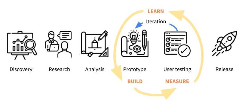
- As we had limited time, we were unable to conduct extensive research, but had access to subject matter experts and current systems to evaluate.
Understanding the problem
Our team had some experience of building existing banking systems, including my work on Barclays One, and Dun & Bradstreet’s Risk Analytics platform, but we wanted more in-depth insights, so met with two subject matter experts from our company. They provided insights into the processes, as well as suggesting areas where we could demonstrate knowledge and suggest improvements.
We also conducted desk research of existing banking signup processes. Some of our discoveries included:
- The signup process was designed to be direct and free from distractions, encouraging the user to stay focussed on the task and see it through to completion.
- Exploring existing processes, we found that visual identity and branding changed when following certain paths, which gave the experience a disjointed feel which was something we didn’t want to replicate.
- We couldn’t complete our research all the way through the process, as this would have involved actually signing up for an account, but we noticed that the reminders from the bank encouraging us to come back and finish the process didn’t involve any ability to decline or unsubscribe, which is something we felt we could improve upon.
- We also researched information provided by Companies House and data broker APIs, so we could see the information that customer details would be checked against.

Using everything we had learned, I worked with our Junior Designer to map out user journeys from both the Customer and Employee perspectives, examining how they achieved their aims, the flow of information and messaging from one side to the other, and interrogating those processes to refine ideas, identify problems, and highlight opportunities for improvement. We then presented these ideas to our team and the subject matter experts for feedback.
Some key points from this work:
- We identified that the signup process should be as easy as possible for the Customer
- The process may not be completed in one session – we will inform the customer what is required beforehand, but should also allow for the possibility that they may need to leave the session to get documents or information, and provide them with easy ways to rejoin the session later on.
- Customers expect a quick response, so we should help employees to access information as soon as it is provided, and help them to manage timelines to maintain the expected level of service.
We also conducted desk research into existing generative AI systems, to understand the ways in which we could enhance the process we were building. Some of our discoveries included:
- Generative AI works well in answering questions, and can switch between guiding the Customer on the signup process and answering questions, but we should be aware of the fact that it can sometimes be prone to giving bad advice, and we should work to prevent this from happening.
- It can also be good at working quickly with large data sets, therefore streamlining checking processes, but everything should be double checked by a human. This is highly important in banking systems where errors could infringe compliance regulations.
The Customer signup process


The Employee checking process


Outcome
We provided the above designs to our development team, who turned them into a working proof of concept, which was submitted to the client bank, winning the bid.
Retrospective
- Overall, I feel that we made a good effort with the limited time given, understanding the context and identifying key points which helped improve the product.
- Naturally, I would have liked more opportunity to research and test my ideas in more depth, as reviewing our work after the fact, I can see parts where we could have improved the solution further.
- However, I’m happy to have had the chance to understand the abilities and limitations of AI, as it is growing exponentially in the technology space, and it is highly important to know what it can and can’t do, so it can be applied properly.
Thank you for reading all the way through my case study! If you’d like to discuss what I can do for you, please get in touch.