Building a remote design team, and advocating for better UX practices

Creating a design team in India, improving skills and permeating UX throughout a company

Introduction

This case study includes
My role
  • UX Lead
Team
  • Leadership
  • Multifunctional product teams
  • My own design team
Stakeholders
  • Heads of Design
  • C-suite executives
Timeline
  • Various roles since 2016
Overview

Since reaching the role of UX Lead in 2016, I have both worked on creating and maturing design teams when I have been given the opportunity to do so. In other situations, I have advocated for user-centred design principles and better ways of working, both within multifunctional product teams and across wider companies. Here I share the work I’ve done, and the methods I’ve used to achieve success in my endeavours.

Building and growing a design discipline in India

I spent several years working in an international product team within a scientific publishing company, with Business and Product Management roles in Germany, and the Product Development team in India. I was then offered the chance to start a UX design team in the Pune office, as it became clear that it would be more efficient for designers to be situated in the same office as the product teams they worked with.

The brief

  • To create a team of six designers who would be assigned to different product teams, understanding the specific requirements of those teams, and ensuring the designers allocated were suited to those requirements
  • Providing support to my team members, helping them with their everyday work and interactions with their team and the company, and helping them to learn and mature as designers
  • To work with my designers, their teams and others within the Pune office to raise awareness of user-centred design and improve working practices.
  • To represent my team and advocate for their needs within the wider international design discipline, covering 36 designers in 4 countries.

Part one: recruitment

  • The first stage was finding the designers to be in my team
  • As I was based in London, I had to initially plan and hold the recruitment remotely, then flying across to Pune to hold in-person interviews.
  • The process had various stages, mirroring the same processes that our design discipline used to recruit designers in other countries, and so not only did I have to plan interviews for myself and the candidates, but also with team members they would be working with (to ensure that they would be able to work together), as well as final interviews with the Global Head of Design.
  • We found the market to be very competitive, with a limited number of candidates who had a good understanding of UX being able to pick and choose roles offered to them. As I also had limited time in which I could interview them in person, I devised a process that would after an initial screener call to assess ability, would get them into the office for a day where we could conduct interviews and practical tasks, before making them an offer by the end of the day. This method helped us to make attractive offers to candidates before another company got to them first.
A diagram showing the devised process for recruiting User Experience Designers in Pune
Sketch showing the recruitment process we used in Pune, from CV reviews and online screener calls to holding interviews and practicals in one day, so that we could quickly assess and hire candidates.
  • As tech roles have a strong male dominance, we wanted to ensure when advertising the role that we could appeal to as diverse a pool of candidates as possible.
  • We therefore used Lou Adler’s Performance Based Hiring, a principle that advertised the role based upon what they would be doing, rather than a laundry list of skills and past achievements. This was due to the fact that candidates who weren’t male often looked at lists like these and assumed that they would not be suitable for it if they could not prove every requirements, while male candidates felt they could apply for a role if they suited some or most of the requirements.
A written job listing, showing what will be expected of an employee in the first 3 months, 6 months and beyond.
An example of a job listing based upon Performance Based Hiring. Instead of listing required skills and abilities, the job posting defines that the prospective employee will be doing, which allows people to adapt their own experiences, rather than being daunted by not having specific experiences.
  • The HR team in our Pune office were very helpful in arranging the advertising and screening candidates, but did have some trouble adopting this new approach. I worked closely with them to help them understand these new practices, and work out the best way to review applicants.
  • Thankfully, the approach worked, and we ended up hiring a very balanced and capable team.

Part two: support

  • Working back in London, I would have weekly 1-2-1 sessions with each of my team members, as a chance to review the work they were doing, and discuss any questions that they were encountering. This also supplemented the fact that they could reach me at any time via Teams or email, so that questions could be answered as quickly as possible.
  • I also had weekly meetings with Product Owners and Team heads to gain feedback on my team, discuss any problems, and plan initiatives to improve ways of working.
  • I visited the Pune office 4-5 times a year, where I would be able to support my team in person, as well as see them working in their own teams. We would also held retrospective sessions to collect feedback from the team about their working experiences, discuss approaches and devise solutions.
  • These were all then reported back to the Global Head of UX, along with my fellow UX Leads, so that we could devise a combined approach to our various teams.
Sticky notes on a board, outlining the outcomes of a session discussing the problems we face
A view of an “anchors and engines” session (deliberately obscured, for privacy reasons), where participants can raise issues that are driving them on, or holding them back. Below are sails (extra things we might do to improve our process) and sharks (things we should look out for). These can then be grouped and discussed to devise a plan of action.

Part three: development

  • As the UX leadership, we defined that the two areas of focus should be:
    • Improving the design skills and maturity of our teams of designers
    • Improving design knowledge and practices across product teams and the wider company
  • Using models generated from Jared Spool’s work, we created two tools to help us with these efforts:

1. Improving design skills

  • In order to measure and improve skills across our teams in four different countries, we needed to establish a baseline on which they were all measured.
  • As UX covers a wealth of different skills and disciplines, some prominent while others are less visible, we wanted to ensure that we could assess each member of our teams on those skills.
  • We devised a Skills Map, detailing every skill and discipline that UX design covers, breaking them down into smaller aspects, and mapped the skills out into five areas; Research, Analysis and Strategy, Design, Delivery and Core Skills. This gave us levels of granularity to properly identify excellence and knowledge gaps.
  • We then created a scale on which to measure ability in each skill, from zero (meaning that they knew absolutely nothing about this subject) through to three (meaning that they were enough of an authority on the subject that they would be willing to stand up tomorrow and give a talk about it).
Feels in a table in excel, showing the overall skill of Analytics, and facets of that skill, such as Basic Concepts, Setting up and Statistics.
Example of a Skill and different facets within to be assessed on. We would discuss each facet with our reports, and assess how much they felt they knew about each section, marking each section from 0 (don’t know anything about it at all) to 3 (could give a talk about it tomorrow).
  • Using these scales, we were then able to sit with each of our reports and go through the Skills Map, asking them to honestly declare how comfortable they felt with each subject. Rather than just taking their word for it, we would challenge them if we felt they had under or over estimated on a certain scale.
  • By doing this, we were able to draw together the final scores to understand where our reports knew a lot about a given area where we could use their knowledge to help educate others, or opportunities for improvement where we could help them understand more.
Screenshot showing the spreadsheet and analytics we used to measure skills levels across the UX team
Using these skills maps, we could then put together a picture of people’s abilities in different sections, and identify areas for study and tuition.

2. Improving design knowledge

  • As well as assessing our designers, we wanted to run a similar process with our product teams, in order to identify opportunities for improving design knowledge and maturity, and recommend better ways of working.
  • Using a UX playbook devised by Jared Spool, which defined areas of design maturity within teams and organisations, and worked on a similar 4-point scale to our Skills Maps above, we were able to conduct similar reviews with our design reports and other members of their product teams, to give their own opinions around how involved and infused UX Design was within their own working practices.
  • As above, this helped us to define a UX strategy roadmap of work to help improve that design maturity within production teams and the wider company, which we could then work with our designer reports to enact.
  • With this approach, we were able to get Product Owners and Business Analysts, Developers and Project Managers focussing their work around user needs. This led to better understand of not just what they were building, but the reason why they were building it, and gave them more agency and satisfaction in their work, which led them taking active interest in how the product performed after launch.

Championing better design practices

As part of the work I did in India, as well as in other roles, I’ve created and delivered programmes of work to help teams and companies realise the benefits of user-focussed production and improve their ways of working.

Introductory presentations

Often within companies who don’t have much design maturity, people who aren’t designers either won’t have heard of user-centred design, or will assume it’s solely the remit of the design department. In these cases, it’s often useful to start with a presentation which helps set out your position, as well as set a level between those people who have never heard of these concepts with those who might know a little.

Screenshot of a presentation slide, with "UX is not", and a list of different misconceptions around UX
A typical slide from a “What is UX” presentation, breaking some misconceptions around what some perceive UX to be.

These talks are not just standalone events, but openings to conversations and discoveries around current practices; are they confused between the terms UX and UI, do they involve users, or is the product direction solely defined by product owners, expecting the designers to just push pixels? By understanding the current situation, as with the example in India above, it helps us to create a program of work to address these understandings and improve the ways in which teams work and products are delivered. What’s more, as these things are hard to deliver alone, it helps you to identify people who might well be useful allies and advocates, to help support and spread your message.

Information sheets

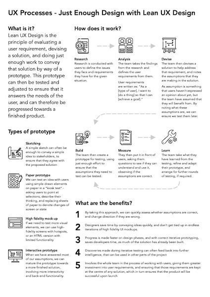
Whilst a presentation might be useful in informing people of your plans, it is also useful to communicate smaller concepts with colleagues and stakeholders during projects. One such method we devised was designing “One Page UX Processes”, a series of one page PDFs which we could use as a tool to help explain a concept to someone, and then leave behind with them to later review, or share with others. We designed the sheets to give a high-level overview, explaining what each concept is, how it works, and the benefits of using it.

Single sheet explaining the processes behind Lean UX Design
An example “One Page Process Sheet”, explaining principles behind Iterative Processing and Lean UX Design

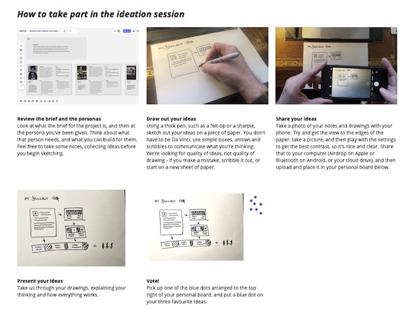
Remote ideation workshop

People often learn better by doing, and, when asked to provide a short workshop during a remote office activity afternoon, I saw the opportunity to provide something that would both educate and entertain. I therefore devised a small ideation workshop, which would help my colleagues to learn about the UX process, as well as having a chance to be creative, think in ways they were not used to thinking, and even introduce a note of competition around the solutions they created.

I worked out a simple open ended problem, asking them to devise a route-finding application, and then created three personas – an old man, a blind woman, and a cycle courier. I introduced the team to the problem and these three personas, and asked them to draw a solution which took the requirements of the three personas into consideration. Of course, I assured those who said that they couldn’t draw that this was conceptual, and they could communicate their ideas using boxes, arrows and wording. I gave them about 20 minutes to draw, and then asked each person to share and explain their ideas with the group, encouraging the rest of the group to ask questions and provide feedback after they had finished. The group said that they found the session highly enjoyable, and felt that they appreciated how UX design was focussed upon user needs, rather than something dreamed up by the production team.

Step by step guide, showing people how to draw and share their ideas in the ideation session
The guide I provided to the remote ideation session, showing how people could draw and share their ideas with the group

Blog posts

UX is a continual learning process, and during my work, I also make interesting discoveries. I was invited to share some thoughts on the company blog, and so again used this as a teaching opportunity. I wanted to share details about the importance of an iterative approach to software production, but felt that just talking about that could be seen as a bit dry. I remembered the story that I had read when I was young of Percy Shaw, who discovered Cats Eyes, the road safety feature that lit up the centre white line of the road by reflecting car headlights back at them. I remembered in the story about how Shaw had iterated numerous times on his design, and had even literally “road tested” his creations on a stretch of country road late at night himself, eventually gaining a contract with the Government to produce them for UK roads, after streetlights were put out to evade bombing runs in World War II. This blog post gained praise from colleagues and clients, and became a useful link to share with people who tried to cut corners when it came to testing the products they were building.

Thumbnail of blog post page
The blog post I wrote on Cats Eyes, and showing the value of iterative design and testing

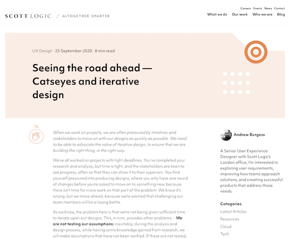
You can read my post here on the Scott Logic blog.

The most important part: conversation

All of the above initiatives can be useful ways of communicating ideas, but their efficacy is severely diminished without one important element – conversation. This could be discussions of UX processes during a project, a chat with a colleague during a coffee break, or any number of touchpoint interactions where you get the chance to discuss how you can help with a problem. The conversations help glue together other initiatives such as the ones above, and help remind people of their existence, so that when a situation arises which could benefit from these approaches, they turn to UX for help.

As previously mentioned, you can also use these opportunities to work out the people who are more receptive and excited by how these ideas can help. These people can often turn into advocates, who can help you spread the message, and, if they are senior, might even help effect change within company-wide practices.

Conclusion

  • I’ve successfully created a user-focussed production culture within several companies, both in manager and non-manager roles, helping them to work together better and deliver more successful products, which have in turn led to increased profits and happier teams.
  • People in teams I have managed have gone on to excel in their careers, with the help of my mentoring. Some have risen to more senior roles afterwards, including Heads and Directors of Design.
  • If you’re interested in what I could do for your company, why not get in touch?

Learning to build the right thing; how you can apply user research to make your product successful

Man taking notes on sheets of paper

How and why you should conduct better user research in your projects

Introduction

Having worked on software development projects for a range of different clients and industries, I have frequently seen that user research is conducted poorly, or even not at all. In this piece, I conduct an in-depth analysis of how to conduct successful user research for your project, and why it is so important. This includes:

  • Planning our your research
  • Getting the most out of your interviews
  • What to do after each interview
  • Analysing research findings
  • Sharing your discoveries with your team

Read “Learning to build the right thing – how you can use user research to make your product more successful” on Medium.

From lift‑and‑shift to insight‑driven innovation: Reducing missed trades by 80% with user research

From lift‑and‑shift to insight‑driven innovation: Reducing missed trades by 80% with user research

Introduction

Originally brought in for a “lift and shift” project, upgrading the Bonds Trading platform for a major international bank, we identified fundamental user issues and transformed the interface into one that adapted to those needs, making trading faster and preventing mistakes.

My role
  • User Experience and User Interface Design Consultant
Team
  • Engagement Lead
  • Client Product Owner
  • Engagement Development Team
  • Client Development Team
  • Client Business Analysts and Subject Matter Experts
Timeline
  • July – September 2020 (3 months)

Research

Initial explorations

In order to get a picture of the Bonds Trading process and how the software was originally designed and built, I held conversations with developers and Business Analysts at the client bank. From these conversations, I put together a simple idea of the process, as well as flagging up possible areas for exploration and pain points to explore:

Whiteboard with post-it notes and written text, describing simple discoveries in the user journey
My initial explorations describing the stages of the RFQ process (blue), identifying problems and questions (red), as well as questions and opportunities (green)

Speaking with traders

With this background, I was then ready to speak to actual traders, and managed to get the Product Owner to put me in touch with people from each of the different trading desks that used the platform. As this was during the pandemic, this was all done remotely with calls early in the morning for traders in East Asia or later in the day for those on the West Coast of the USA.

The traders were unable to stop their trading while being interviewed, and so I quickly found I had to adapt my questioning to anticipate the frequent and often loud interruptions from the trading. Also, rather than getting a “laundry list” of demands about the current software, I found it better to ask them about the RFQ Bonds trading process, getting a better understanding of the actual requirements as well as method and motivation (much like the approach I used to understand the materials science research process for Springer Materials), which helped me validate hypotheses and identify opportunities to improve the system.

A screenshot of part of my interview script, showing gaps between every 3-4 questions
A screenshot of my interview script, showing gaps every 3-4 questions, in order to anticipate interruptions while Traders were working.

Major discoveries from the research

  1. The current system was overloaded
    • The current solution had originally been built around the needs of a few trading desks, and then adapted to the needs of other desks over time, adding more features as they were requested.
    • This led to experience rot in the system, where the added features and functionality strained both the design and implementation of the system. This was combined with the fact that the current system had jarring colours and loud noises, which could be confusing for some traders
    • This led to problems such as tickets obscuring each other, buttons being hard to locate, and the system slowing down, causing the traders to miss vital trades and make mistakes.
  2. We had to adapt to different requirements
    • Speaking to traders on different desks, we found that they had differing requirements, but that these requirements could be simplified down into two main issues; complexity of information required on each trade, and the number of trades they made each day.
    • We found that each of the traders and their desks fitted on a scale, with some working on a larger number of tickets, but requiring less additional information to make the trades, and those who traded less tickets per day, but required more information to make their trades:
Graph showing the relationships between different types of users along a sliding scale of numbers of tickets versus complexity of tickets
Graph showing the sliding scale of different user types, based upon complexity of tickets (amount of information shown on them) against “traffic” (number of tickets dealt with per day).
  1. Traders didn’t make all their trades themselves
    • Traders oversaw the trading process, but required ways to easily discount tickets which were not relevant to them, or could be easily responded to. Therefore, we needed a way for traders to hide those less relevant tickets, but still be able to check back and retrace them if required.

Demonstrating value through discovery

Following my research, the Product Owner was keen to see some visual progress of my work, and I felt it was best to demonstrate the value of my efforts with ideating and testing assumptions through low-fidelity prototyping, which I could test with him, the Subject Matter Experts and Traders, in order to answer questions while showing progress.

Below are some of the concepts I experimented with:

A wireframe, detailing how users can define what appears on each part of the screen, as well as save and share their layouts
A customisable screen layout that allows users to prioritise information to their own needs, while ensuring that key data is not obscured.

Customisable screen layout

  • To overcome the issue of displaying tickets that overlap each other, we needed to revise the design in order to ensure that tickets could be shown and prioritised without obscuring key information.
  • I therefore designed a screen layout which users could adapt to their preferences, using the rule established above, showing prioritising components showing tickets, or supporting information, in a way that suited their own workflow.
  • Traders could set up the screen the way that they wanted, save them, and even share them with colleagues, as we found that many Traders would often copy from the one Trader who had taken the time to revise their set up.
Wireframe showing how multiple tickets can be stacked and displayed with more or less information
Showing how users could not only change the size of tickets and the supporting information inside them, but also triage tickets to suit their own Trading style.

Working with tickets

  • Also following the trend that we had identified, we wanted Traders to be able to be able to customise the ways in which they viewed and worked with tickets within the tickets section of the app
  • We wanted tickets to be able to show either fewer large tickets onscreen at one time, to show more supporting information, or more smaller tickets with less supporting information, depending upon where their Trading style fitted on our trend line.
  • Traders could also arrange “triage”, setting criteria to sort tickets into ones that they dealt with themselves, or ones that they could get the application to deal with automatically (such as refusing tickets that were below a certain price, or changing settings to cope with high traffic periods).
  • To give the Traders more control, we built in the ability for them to check these automatic trades “under the hood”, ensuring that they could quickly check and see that things were going as they had planned.
A series of designs, with a flowchart exploring concepts at the top, black and white wireframes of tickets, and a finished colour version of the ticket at the bottom, showing how the menu overlay works.
Concepts, black and white wireframes and colour UI exploring the concept of the overlay menu to increase or decrease prices incrementally.
A series of user interface designs showing a central numbers and a series of buttons around it, allowing the user to incrementally change the value.
UI exploration around how the “daisy wheel” overlay could allow users to quickly and incrementally adjust bid prices without taking their hand off the mouse.

Improving functionality

    • As speed is the essence with RFQ trading, Traders expressed the need to be able to adjust bid prices quickly and precisely as a counter offer before returning them back for confirmation.
    • Observing the ways in which the Traders worked, we found that they relied on mouse input, and didn’t want to keep swapping back to the keyboard. It was because of this that we developed the “daisy wheel” approach, allowing users to quickly adjust big prices in set increments in a controlled way.
    • This also allowed us to show other prices, so the users could stay informed with adjusting their bid without having to look over at another side of the screen.
UI design components sheet showing the styling of buttons
Atoms – showing the styling of smallest components
A UI design sheet showing how atom components fit together to make medium size components
Molecule components – showing how atoms fit together to make slightly larger components
UI design sheet showing organisms, made of atom and molecule components, such as tickets
Organism components, showing how the atoms and molecules fit together into larger components, such as tickets
Full screen version showing a customised layout with large tickets, stacked tickets and supporting analytics
Pulling the whole thing together into a screen that highlights important information, triages tickets and provides background analytics

Creating a design system

  • As the sole designer on the team, I had to redesign numerous components, each of which had to be reviewed by stakeholders and tested with Traders.
  • This led to numerous revisions of components, which had knock-on effects to other elements within the user interface.
  • In order to reduce workload and maintain fidelity, I devised an atomic design system defining everything based upon a hierarchy:
    • Atoms (smallest possible items, such as buttons or labels)
    • Molecules (combinations of atoms, such as an input form)
    • Organisms (groups of molecules, such as a ticket)
  • This helped to define onscreen colours, information and messaging that didn’t fight for the user’s attention, and helped them to focus on what was most important.
  • Due to the modular nature of the design system, this also helped the Development team to produce a modular component system using Storybook, meaning that quick changes to the master would cascade down to code that had already been implemented.

“I really appreciate how much easier this is to use, it’s really helping me to do my job better”

Trader from the Bonds trading desk in Tokyo

Outcomes

  • From my efforts, the platform was proven to make trading faster and more effective, leading to a reduction in lost trades by 80%, and many traders reporting much better experiences with the platform.
  • The initial engagement only lasted three months before I was moved on to another project, but I was asked back later by the Product Owner for further work on the projects s I was “the only designer who understood the context”, which was quite a change from the skepticism he originally expressed in my design thinking process.
  • I was later asked to be part of a town hall interview at my consultancy, explaining the work that we did, and how we made it into a success. I also wrote an in-depth analysis of how and why you should conduct better user research in your projects, to help demonstrate to colleagues and clients why design should be considered at the start of the project, and how that can help to make highly successful outcomes.

If you’re interested in how I can help your complex project to be more successful, why not message me, and we can discuss your requirements?

Seeing the road ahead — Catseyes and iterative design

Close up of a "catseye" reflective road stud, in the middle of a road

How road safety measures show the value of revising your design work

Introduction

Having previously worked on projects where stakeholders had set a tight timeframe, and not allowed for any testing and iteration of the solution, I wanted to explore the concept of iterative design, and how it can benefit a project. I had learned as a child about the story of Percy Shaw, and how he had devised Catseyes, the reflective studs that illuminate the centre line of a road, inspired by the eyes of an actual cat reflecting his car’s headlights one evening. Using this example, I describe how Shaw didn’t just create his solution from that discovery, but went on to revise his design, test it, and incorporate new ideas until he produced the design that we know today. In the same way, projects can benefit from this approach, getting feedback on their designs, and ensuring that they suit user needs, before they are launched.

Read “Seeing the road ahead — Catseyes and iterative design” on Medium

How to improve your job search

Office space in black and white

Sharing my experiences with job hunting in the UK tech industry

Introduction

On average, people in the UK tech industry change jobs every two years. Having had some experience myself of the difficulties around navigating the recruitment space, I thought I would provide some insights and tips around things I have found useful. These include details such as:

  • Defining your ideal job role, and what you want from it
  • Self promotion, including how to put together your CV and portfolio of work
  • Making applications to adverts, and keeping track of which applications you have and have not been successful in, and following up those you haven’t heard from
  • Tips around how best to present yourself at interviews, from screener calls through to face-to-face interviews

Read “How to improve your job search” on Medium.

Insight to impact: How user insights and team collaboration made a best-in-class scientific database

Insight to impact: How user insights and team collaboration made a best-in-class scientific database

Introduction

With over a century worth of highly respected materials science journals, Springer (now Springer Nature) created Springer Materials, an online database for easier access by their audience of academic and corporate scientists worldwide. After several years online, Springer Materials was now suffering a decline in usage and renewed subscriptions. We wanted to understand the reasons for this decline, and explore ways in which we could create more value for customers to encourage them back.

Project Details

My role
  • Senior UX Designer (London)
Team
  • Technical and Business Product Owners (Heidelberg, Germany)
  • Junior UX Designer (Pune, India)
  • Business Analysts, Project Manager, 6 Developers (Pune, India)
Timeline
  • October 2014 – October 2016 (2 years)

Discovery

Recruiting users

One of the first hurdles we faced was the fact that the Product Owners had no contact with users, and so were unable to provide them for research. I therefore had to look up companies and institutions on LinkedIn, write to Heads of Departments and key individuals to request participation.

Part of a poster with the headline "Materials Scientists Needed" and a request for materials scientists to take part in user interview sessions over Skype or in person, for a £50 Amazon voucher or donation to charity in their name.
Part of a poster I created and sent to researched institutions and companies to encourage people to sign up for user research sessions

While this was a time-consuming process, I was able to get a good understanding of the types of user involved, and put together a group of users with whom I could conduct research and testing, as well as add and remove users depending upon availability. This ensured that I woudn’t have to repeat the recruitment process again, and also had a set of varying opinions and perspectives.

Planning the research

As I am not a materials Scientist, I worked with my Subject Matter Expert colleagues to understand the current state of the platform, and how it was used. This helped me to refine my research into four key stages to examine:

A handwritten sketch of a flow of box and arrows, showing the four stages I studied: before the user comes to the site, how the user looks for information, how they view the information on the site, and what they do with it after they leave.
The four key stages around which I based my research: what brings the user to the database, how do they search for information, how do they work with the information they need, and how do they take it away. This not only worked for this project, but has become a useful model for quickly understanding future products.

Involving the team

As well as improving my own knowledge, it was important to help my product team understand the context behind decisions, and so in order to include them in research sessions, I would have them listen in to the call, and provide questions suggestions via Slack. This helped them to take part and foster empathy with the users, without interrupting the flow of the interview.

A photo of two laptops, one next to each other. The left hand laptop is showing a video call with a website as the main view. The right hand laptop shows a text conversation in Slack. There is a a piece of paper with questions in front of the laptops and a can of Diet Coke to the right of the laptops. This is my set up for when I interviewed people online.
A remote user research call, with the call viewing the product on the main laptop screen. I have my written questions in front of me, and on the right is a Slack channel with my colleagues listening in. My team can ask me to ask questions to users on their behalf, to help their own understanding.

Major discoveries from the research

  1. What brings the user to the site?
    • Users were often provided access to Springer Materials by their company or institution, and used it to look up data for their own research and experiments because of Springer’s reputation within scientific publishing
    • However, they had found their experience in locating the data they needed to be frustrating and unclear, which they reported back to the people who bought the subscriptions, leading to a decline in renewals.
  2. How do they search for the information?
    • The most common search terms were for a material and a property, such as ”steel melting point” or “mercury surface tension”.
    • However, users expressed frustration with the results they received, with searches not giving desired results. when they found what they wanted, they would have to click on multiple pages to actually locate the information they needed.
  3. How do they work with the information they need?
    • As the site had been based upon scientific journals, when the users found the relevant page, they would then have to download a PDF with image scanned pages, which they would then search through by hand to obtain the data they need.
  4. How do they take the information away?
    • As the data was image scanned, there was no way to digitally export it, and so users would have to print or write it out by hand, or type it into another application themselves.

Analysis: co-location

Our product team and stakeholders gathered at our Pune office for a week together to analyse the findings:

  • Presenting my research findings, I defined the key discoveries and provided personas to identify the needs of different user types.
  • I then organised sessions building empathy maps and user journeys to further explore the problems and identify what we knew against assumptions to be explored later.
  • We split into small groups, coming up with ideas that leveraged different expertise and viewpoints, which were presented back to the wider group for criticism and discussion.
  • This then helped us come up a with a series of concepts which we could build into prototypes to test with users and challenge assumptions.
  • Working with the Product owners and Business Analysts, we could then prioritise solutions on an Impact vs Effort matrix, which helped us to build a plan for the work, ensuring that we could demonstrate value quickly while also keeping larger pieces of work for later impact.
Andrew Burgess standing in front of a glass wall with sheets of paper and post its, presenting ideas to onlookers
Presenting ideas during a collaboration session with team members

Solutions

Improving user journeys

The quickest way of demonstrating value to users was to make the process of finding a piece of information more easy, by reducing the number of steps involved,

  • We started by identifying “red routes”; key journeys that users took through the site to find information, such as finding a specific material such as “benzene”, and looking up a property such as “boiling point”
  • We identified in our research that the user journey had bloated due to “experience rot” (continual addition of extra pages and features outside the original remit that confuse the original objectives and impair user success).
  • Taking those key routes, we quickly mocked up clickable prototypes for users to try, ensuring that our assumptions met with their mental models, and gaining feedback before revising the actual database.
  • During this testing, we also identified opportunities such as digitising the data within the PDFs, which I could then advocate to the business as opportunities for future product development
A digital sketch of six screens with annotations
User journey illustrating the five pages and one PDF, with their interaction points, that the user had to navigate to reach a required piece of information.
A much simpler sketch of a user journey than the one above containing only three screens.
I managed to boil this user journey down to a mere three pages, including the home page, search and details page (see digitised data below).

Making pages responsive

During our research, we identified not only the different requirements for each persona, but also discussed with them the different scenarios in which they would access the database. For example:

  • People accessing the site on a mobile device would often want to check a single, specific piece of data, and appreciated the ability to access the information quickly, without having functionality that they did not require at the time get in the way.
    • This also worked for people who would view the database on a smaller window on a desktop, ensuring that their view focussed upon the information that was key to their search
  • People who accessed the site while sat down, with a larger device such as a laptop or desktop, would want to spend more time investigating, and would want more supporting information

By returning to our “red routes”, we could then examine them with an extra dimension, ensuring that the layout and display for different device sizes responded to those requirements

Page of sketches exploring different details on the page, such as tables and graphs, and how they would work on desktop, tablet and mobile screens
Sketches showing how to adapt different parts of pages to different screen sizes. This allowed us to prioritise information around the different use cases for each form factor.

Improving search

A larger piece of work, we recognised that improving the results given in search would be more effort, but highly important in ensuring that users could find the information they required.

  • We asked users to take us through their search processes, and highlight where they saw results that they felt were not suitable to their queries.
  • We then reviewed with the developers, and discovered that it was the markLogic text-based search that was the problem, which only searched for text strings, and didn’t understand context.
  • We identified the key problem was that the simple case-agnostic text-based search was not suited to the nuance of certain search terms, for example:
    • “tin” refers to the metal; tin
    • “TiN” refers to the material Titanium Nitrate
    • As the search did not understand the context, typing either of those terms into the search would yield the same results.
  • We therefore explored a number of solutions, including:
    • case-sensitive searching, to understand specific chemical terms.
    • contextual drop-downs, to allow the user to specify which terms they were searching for
    • bringing in search database experts to implement a graph search, which created a contextual model between inputs (such as recognising tin as a metal, which would therefore have a link to steel, which is also a metal, but not tincture, which is a chemical process, but has the letters “tin” in it)
  • We built a solution that could analyse the different cases and chemical terms, as well as building a new graph search database, which would understand the relationships between different materials, such as metals, providing even richer search results.
  • This was then placed on a separate testing link, allowing us to test with users remotely, as well as in person, including taking it to various Chemistry Conferences in the USA, where we could conduct guerrilla testing with attendees, for a wider set of results.
Sketch planning, exploring ways that we could improve the context of the search results
Sketches to explore different methods of providing contextual search to the platform

“This is great. It really will save me a lot of time searching in the future.”

Corporate Researcher during testing at Materials Research Society Boston Conference 2016

Developing the homepage

As well as catering to the requirements of the scientists and researchers who used the platform, by examining the needs of the Buyer, we recognised that the homepage had three important roles:

  1. To provide a starting point for users to explore the content
  2. To update returning users with new developments
  3. To demonstrate value for non-technical users such as Buyers

We therefore redesigned the homepage to include the following features:

  • A summary of the different types of content for new users to explore,
  • A timeline of latest additions and improvements to update returning users
  • Details of the depth of information and sources to demonstrate value for Buyers

These changes were added over time, to accommodate the work around supporting these features, and other efforts on the database.

Sketches showing the Springer Materials homepage at differing screen sizes, and how the content layout would adapt
Sketches to explore how content would adapt to different screen widths
Before and after versions of the homepage, showing clearer layout, browsing prompts and latest developments
Before and after versions of the homepage, showing how we introduced clearer information and layout, browsing prompts and latest updates

Making data digital

One of the most fundamental solutions that we identified with the product, with the highest level of impact but also the greatest level of effort, was the fact that the data needed to be digitised. At the start of the project, data existed solely within the database as scanned-in pages from scientific books and journals, which frustrated users, and led to users feign that the product was not worth the subscription price.

it was this impact on subscription revenues that allowed me to petition Product Owners to organise a way of tackling this problem. Using the company’s relationship with client institutions, they were able to find a group of post-doctorate scientists to work through the scanned pages, performing specialist data entry to extract and annotate data for the graph search database, converting the scanned data into a fully digitised format. This work took about a year to complete, but this had a profound effect on the how we could make the product more valuable to users.

Surfacing results early

The digitised data meant that we could include it within search results, meaning that simple questions could be answered sooner, and demonstrating value more quickly. These could be displayed as search snippets, filled with simple answers, that led on to pages with more complex insights.

Sketch of a search snippet - a box showing details such as the boiling point of water as 100 degrees Celsius, the chemical compound of water, and a small graph with further information below it
Sketch suggestion detailing the ways in which information could be surfaced early by providing simple details that inform users and lead them on to more in-depth information on subsequent pages

Working with data

We recognised that the majority users searched with the same pattern, namely a material (such as iron, benzene or carbon) and a property (such as boiling or melting point, band gap, or similar). By understanding this, we could use our newly digitised data to improve our offering:

  • When a user first searches for a material and property, then we can surface the simplest answer in the search snippet, as described above.
  • If the user wants more in-depth information, then they can click through to a page providing a dynamic graph, which uses the findings from scientific papers to plot data in a visual away, demonstrating the behaviour of the material and the property against a scale – for example, demonstrating how the boiling point of steel changes when submitted to different atmospheric pressures.
  • Alongside this graph, the results are also provided in a tabular format, which allows users to work with the data displayed in the graph. They can change criteria, expand or limit the dataset, all to ensure that they get the information they require for their purposes.
  • As the last part of the model we discovered, this data can then be exported into a range of format, such as visual images of the graph, or spreadsheets of the results, facilitating use in the user’s work.

“This is awesome. I don’t think anyone else is doing this. Where do I sign up to get it?”

Student Researcher during testing at American Chemistry Conference, Philadelphia 2016

Page of sketches showing information shown on different screens such as search results, graphs and tables, as well as the search snippets shown above
Sketches exploring how details can be surfaced progressively, providing key information early, leading on to more customised detail later on. These concepts helped me to explore concepts and develop solutions with my team.
A sketch and a screenshot of a page with a graph and tables of results for a characteristic of a material
My sketch and a screenshot of the results page – showing details of the behaviour of a property of a material that the user has searched for. The table below shows the information in numerical form for export and links for citations.

Outcomes

  • Our work reversed the customer attrition that 
the product was experiencing, and brought a 32% subscription increase from academic, corporate 
and other clients
  • Within two years, that extra revenue paid for all of our salaries and the money that the company had paid into the project.
  • Developing the digital data pages won accolades 
for the product as a “best in class” tool from the 
American Chemistry Society conference in 2016
  • In 2017, the Indian Government bought licences to provide the product in all libraries across their country
  • A site survey, run at the end of my tenure as UX design lead, showed that 69.2% classified the product as “great”, a 22% improvement on when I started.

How I created the user experience for my portfolio site

A clean design for my work

Summary

For many years, I have been using my website, SableIndustries, to represent the work that I do. However, in recent years, it has been in need of an update. This piece takes you through the process I followed in order to ensure that the website echoed the design thinking that I have learned in my work, as well as the work itself.
Continue reading

User Experience Design, a personal perspective

My own experience of user experience design

User Experience Design, or UXD for short, is described in its Wikipedia entry as “the process of enhancing user satisfaction with a product by improving the usability, accessibility, and pleasure provided in the interaction with the product”. Whilst this is a sufficient summary to explain UXD in a brief way, I wanted to take the chance to explain more about User Experience Design, how I view it, how it works for me, and what how I feel it can be beneficial, not just to me, but for companies that put the user at the centre of what they do.
Continue reading

More about me…

Hi, nice to meet you!

Introduction

Part one

My name is Andrew Robert Burgess, or Andy for short. I’m a User Experience Lead, having worked previously as a Graphic and Digital Designer, and a Front End Developer since I started my career in 1999. This has helped me get a really good understanding of not just the processes which go towards creating a great user experience for the product or service on which I am working, but also experience and knowledge of how best to work with production teams, and knowing what is required to fully optimise that product or service to give the best message and representation.
Continue reading

Designing notifications, or how we could learn to love our phones again

Perhaps the problem isn’t the phone, but the way in which it interacts with you?

Introduction

Another day, another article providing a soul-searching insight into why quitting smartphones is the new quitting smoking. These articles seem to occur regularly in the media these days, with accounts of people who feel trapped by their overuse of their phones, how they feel that their digital life is impinging on their real life, with their phones turning into monsters that continually buzz at them with notifications. These articles end up preaching solutions such as digital detoxes, phone stacking in restaurants, and have quotes from people saying how much better they feel when they don’t have their phones switched on, or even with them.

For me, the problem doesn’t lie with the way we interact with our phones, it’s about how our phones interact with us. When the web giants such as a Facebook, Google and Amazon began to realise just how much money could be made by advertising, they not only cashed in, but began to manipulate their properties so that they could multiply their efforts. The way that this was achieved was by factoring in design and functionality that encouraged compulsive behaviour. You may have heard of the “slot machine” effect of the Facebook newsfeed, encouraging you to pull down and refresh to refresh your newsfeed and get that dopamine hit of new content, or feedback on your contributions (in the interests of fairness, this isn’t actually exclusive to Facebook, many other apps have the same action, with similar effects). Many sites and apps use patterns to encourage further participation, and to keep the user on their product, and, whether intentionally malicious or not, some of these can evolve into dark patterns.

One such dark pattern that’s prevalent on almost every mobile device I know of are notifications. Even if, like me, you’re very stringent on keeping notifications on your phone to a minimum, whenever you download a new app the assumption is that the app can, unless you tell it otherwise, make noises, put messages on your lock screen and show banners whenever it wants to. In order to curtail this, you have to go into your settings and specify what notifications you receive. Apple and Google have made this easier to access in recent years, but it’s still an opt-out process, rather than an opt-in one, and for good reason – app makers want your attention on their products, and so want this way of bombarding you with information regularly, in the hope that you will give in, click on the link, and buy the product. Chances are, you’re probably not quite as hardcore with your notifications, so just imagine how fewer ones you would receive if you could choose to opt-in, rather than have to make the effort to opt-out?

Chances are, companies such as Facebook and Google aren’t going to go away, and they will certainly be around longer than the time you decide to go on your digital detox and later decide to rejoin the connected world, and, what’s more, you can be pretty sure that a lot of your friends are still going to be using them. However, there is a rising tide of interest in how these companies conduct themselves; we’ve seen questions into fake news, how they structure content on your timeline, and whether they should be responsible for the media that appears on their platforms. In my view, we should be asking these companies to not only look at the content they provide, but also the way they provide it. They should work out what their relationship with their users are, and how that they can provide advertising and updates in a more conscientious way. These companies aren’t the only problem, but if we could get them to change and show the benefits of doing so, others may follow suit. Through better notification design, we could learn to love our phones once again.