From lift‑and‑shift to insight‑driven innovation: Reducing missed trades by 80% with user research
Introduction
Originally brought in for a “lift and shift” project, upgrading the Bonds Trading platform for a major international bank, we identified fundamental user issues and transformed the interface into one that adapted to those needs, making trading faster and preventing mistakes.
My role
- User Experience and User Interface Design Consultant
Team
- Engagement Lead
- Client Product Owner
- Engagement Development Team
- Client Development Team
- Client Business Analysts and Subject Matter Experts
Timeline
- July – September 2020 (3 months)
Research
Initial explorations
In order to get a picture of the Bonds Trading process and how the software was originally designed and built, I held conversations with developers and Business Analysts at the client bank. From these conversations, I put together a simple idea of the process, as well as flagging up possible areas for exploration and pain points to explore:
Speaking with traders
With this background, I was then ready to speak to actual traders, and managed to get the Product Owner to put me in touch with people from each of the different trading desks that used the platform. As this was during the pandemic, this was all done remotely with calls early in the morning for traders in East Asia or later in the day for those on the West Coast of the USA.
The traders were unable to stop their trading while being interviewed, and so I quickly found I had to adapt my questioning to anticipate the frequent and often loud interruptions from the trading. Also, rather than getting a “laundry list” of demands about the current software, I found it better to ask them about the RFQ Bonds trading process, getting a better understanding of the actual requirements as well as method and motivation (much like the approach I used to understand the materials science research process for Springer Materials), which helped me validate hypotheses and identify opportunities to improve the system.

Major discoveries from the research
- The current system was overloaded
- The current solution had originally been built around the needs of a few trading desks, and then adapted to the needs of other desks over time, adding more features as they were requested.
- This led to experience rot in the system, where the added features and functionality strained both the design and implementation of the system. This was combined with the fact that the current system had jarring colours and loud noises, which could be confusing for some traders
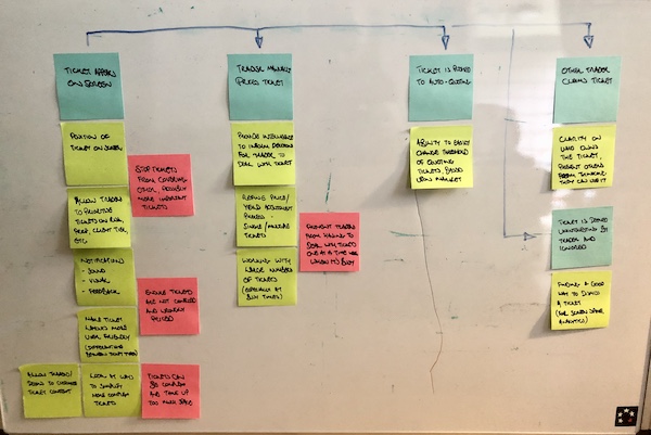
- This led to problems such as tickets obscuring each other, buttons being hard to locate, and the system slowing down, causing the traders to miss vital trades and make mistakes.
- We had to adapt to different requirements
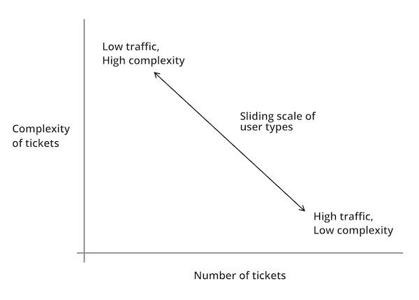
- Speaking to traders on different desks, we found that they had differing requirements, but that these requirements could be simplified down into two main issues; complexity of information required on each trade, and the number of trades they made each day.
- We found that each of the traders and their desks fitted on a scale, with some working on a larger number of tickets, but requiring less additional information to make the trades, and those who traded less tickets per day, but required more information to make their trades:
- Traders didn’t make all their trades themselves
- Traders oversaw the trading process, but required ways to easily discount tickets which were not relevant to them, or could be easily responded to. Therefore, we needed a way for traders to hide those less relevant tickets, but still be able to check back and retrace them if required.
Demonstrating value through discovery
Following my research, the Product Owner was keen to see some visual progress of my work, and I felt it was best to demonstrate the value of my efforts with ideating and testing assumptions through low-fidelity prototyping, which I could test with him, the Subject Matter Experts and Traders, in order to answer questions while showing progress.
Below are some of the concepts I experimented with:
Customisable screen layout
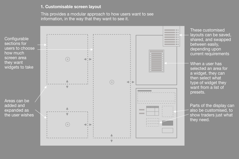
- To overcome the issue of displaying tickets that overlap each other, we needed to revise the design in order to ensure that tickets could be shown and prioritised without obscuring key information.
- I therefore designed a screen layout which users could adapt to their preferences, using the rule established above, showing prioritising components showing tickets, or supporting information, in a way that suited their own workflow.
- Traders could set up the screen the way that they wanted, save them, and even share them with colleagues, as we found that many Traders would often copy from the one Trader who had taken the time to revise their set up.
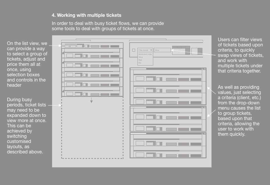
Working with tickets
- Also following the trend that we had identified, we wanted Traders to be able to be able to customise the ways in which they viewed and worked with tickets within the tickets section of the app
- We wanted tickets to be able to show either fewer large tickets onscreen at one time, to show more supporting information, or more smaller tickets with less supporting information, depending upon where their Trading style fitted on our trend line.
- Traders could also arrange “triage”, setting criteria to sort tickets into ones that they dealt with themselves, or ones that they could get the application to deal with automatically (such as refusing tickets that were below a certain price, or changing settings to cope with high traffic periods).
- To give the Traders more control, we built in the ability for them to check these automatic trades “under the hood”, ensuring that they could quickly check and see that things were going as they had planned.

Improving functionality
-
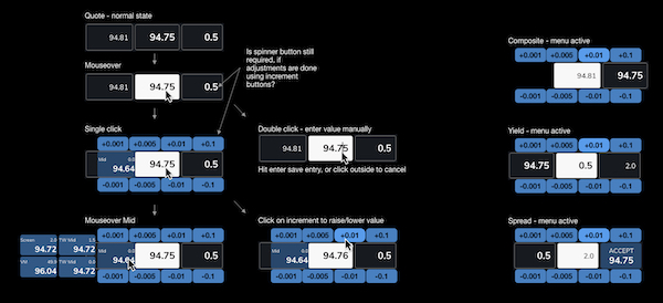
- As speed is the essence with RFQ trading, Traders expressed the need to be able to adjust bid prices quickly and precisely as a counter offer before returning them back for confirmation.
- Observing the ways in which the Traders worked, we found that they relied on mouse input, and didn’t want to keep swapping back to the keyboard. It was because of this that we developed the “daisy wheel” approach, allowing users to quickly adjust big prices in set increments in a controlled way.
- This also allowed us to show other prices, so the users could stay informed with adjusting their bid without having to look over at another side of the screen.


Creating a design system
- As the sole designer on the team, I had to redesign numerous components, each of which had to be reviewed by stakeholders and tested with Traders.
- This led to numerous revisions of components, which had knock-on effects to other elements within the user interface.
- In order to reduce workload and maintain fidelity, I devised an atomic design system defining everything based upon a hierarchy:
- Atoms (smallest possible items, such as buttons or labels)
- Molecules (combinations of atoms, such as an input form)
- Organisms (groups of molecules, such as a ticket)
- This helped to define onscreen colours, information and messaging that didn’t fight for the user’s attention, and helped them to focus on what was most important.
- Due to the modular nature of the design system, this also helped the Development team to produce a modular component system using Storybook, meaning that quick changes to the master would cascade down to code that had already been implemented.
“I really appreciate how much easier this is to use, it’s really helping me to do my job better”
Trader from the Bonds trading desk in Tokyo
Outcomes
- From my efforts, the platform was proven to make trading faster and more effective, leading to a reduction in lost trades by 80%, and many traders reporting much better experiences with the platform.
- The initial engagement only lasted three months before I was moved on to another project, but I was asked back later by the Product Owner for further work on the projects s I was “the only designer who understood the context”, which was quite a change from the skepticism he originally expressed in my design thinking process.
- I was later asked to be part of a town hall interview at my consultancy, explaining the work that we did, and how we made it into a success. I also wrote an in-depth analysis of how and why you should conduct better user research in your projects, to help demonstrate to colleagues and clients why design should be considered at the start of the project, and how that can help to make highly successful outcomes.
If you’re interested in how I can help your complex project to be more successful, why not message me, and we can discuss your requirements?