Designing a Concierge AI that supports Banking Customers and KYC Compliance
Introduction
My role
Lead UX Architect (London, UK)
Team
Junior Designer (Toronto, Canada)
Development Team (Pune, India)
Timeline
3rd-7th March 2025 (1 week)
Summary
In a bid for work with a British bank, we were asked to show how we could leverage generative AI to improve the Business Banking signup process and the KYC checks carried out by employees with the information submitted by customers. In the space of a week, we managed to design a proof-of-concept that guided the customer through the signup process, provided customer support, provided information in a timely manner to employees, performed checks and flagged potential issues, and helped to manage workloads and fulfil performance targets. This project was then given to a development team to build and submit to the client, which ended up winning work for our company.
Background
The British bank that we were creating this for wanted to evaluate our knowledge of banking and KYC processes, as well as being able to demonstrate our understanding of the abilities and limitations of current generative AI systems. They were happy for us to demonstrate this with a system built for British customers, so as not to get into the extra complexities involved with international identification and banking processes.
The Challenge
Create a proof-of-concept system within a week that demonstrated how generative AI can help streamline business bank signup and KYC checks
Involving a product team distributed between Toronto, Pune and London, I had to coordinate efforts and manage work between the team throughout the process.
As we had limited time, we were unable to conduct extensive research, but had access to subject matter experts and current systems to evaluate.
Understanding the problem
Our team had some experience of building existing banking systems, including my work on Barclays One, and Dun & Bradstreet’s Risk Analytics platform, but we wanted more in-depth insights, so met with two subject matter experts from our company. They provided insights into the processes, as well as suggesting areas where we could demonstrate knowledge and suggest improvements.
We also conducted desk research of existing banking signup processes. Some of our discoveries included:
The signup process was designed to be direct and free from distractions, encouraging the user to stay focussed on the task and see it through to completion.
Exploring existing processes, we found that visual identity and branding changed when following certain paths, which gave the experience a disjointed feel which was something we didn’t want to replicate.
We couldn’t complete our research all the way through the process, as this would have involved actually signing up for an account, but we noticed that the reminders from the bank encouraging us to come back and finish the process didn’t involve any ability to decline or unsubscribe, which is something we felt we could improve upon.
We also researched information provided by Companies House and data broker APIs, so we could see the information that customer details would be checked against.
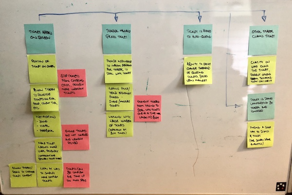
The blue customer and tan employee user journeys, with notes and arrows showing information flow and interaction
Using everything we had learned, I worked with our Junior Designer to map out user journeys from both the Customer and Employee perspectives, examining how they achieved their aims, the flow of information and messaging from one side to the other, and interrogating those processes to refine ideas, identify problems, and highlight opportunities for improvement. We then presented these ideas to our team and the subject matter experts for feedback.
Some key points from this work:
We identified that the signup process should be as easy as possible for the Customer
The process may not be completed in one session – we will inform the customer what is required beforehand, but should also allow for the possibility that they may need to leave the session to get documents or information, and provide them with easy ways to rejoin the session later on.
Customers expect a quick response, so we should help employees to access information as soon as it is provided, and help them to manage timelines to maintain the expected level of service.
We also conducted desk research into existing generative AI systems, to understand the ways in which we could enhance the process we were building. Some of our discoveries included:
Generative AI works well in answering questions, and can switch between guiding the Customer on the signup process and answering questions, but we should be aware of the fact that it can sometimes be prone to giving bad advice, and we should work to prevent this from happening.
It can also be good at working quickly with large data sets, therefore streamlining checking processes, but everything should be double checked by a human. This is highly important in banking systems where errors could infringe compliance regulations.
The Customer signup process
A redesigned homepage, introducing the Customer to the AI Agent, and what they will need to sign up for a Business Bank accountThroughout the process, the AI Agent is presented as an anthropomorphic character, encouraging feelings of relatability, and giving the impression that the Agent is the Customers dedicated service agent.Initial checks to verify the email and mobile details of the Customer are crafted to look like they came from the AI Agent, and include a link to return to the signup process, so that they can easily rejoin their session if they leave it.The Agent can check for errors in the customer’s entries, coaching them to provide correct responses, as well as answering questions from a pre-ordained FAQ list. Any questions which fall outside that remit result in the AI handing the Customer over to a second-line human customer service agent, to prevent the AI from giving incorrect answers.The system can also, through details provided by the customer, reach out to Company Officers and other individuals who will have access to the account, to ask them to provide documentation for checking.Submitting documents can be done through desktop or mobile cameras, with the Agent OCR scanning and image capturing the presented document, so that it can be checked by a human Employee, and the information used in checks.
The Employee checking process
The overview screen shows applications that still require checking, highlighting ones which have been waiting longest, and if they are reaching service agreement time limits. The Agent can answer questions, help the Employee to prioritise workloads, and request transferring work to colleagues if it looks like work will not be finished in time.Viewing an individual report, the AI performs checks on company details, financial reports and details of individuals against data from broker APIs, and highlights possible issues for the Employee to check, and flag for Compliance review if necessary. The Employee can also perform their own checks and raise flags, using the Agent to answer questions or look up information.Detail screens show information on findings around personal information, such as associated names, financial history and professional or family associations, identifying potential issues such as Politically Exposed Persons. These can be reviewed by the Employee, with the Agent answering questions to help with the process.
Outcome
We provided the above designs to our development team, who turned them into a working proof of concept, which was submitted to the client bank, winning the bid.
Retrospective
Overall, I feel that we made a good effort with the limited time given, understanding the context and identifying key points which helped improve the product.
Naturally, I would have liked more opportunity to research and test my ideas in more depth, as reviewing our work after the fact, I can see parts where we could have improved the solution further.
However, I’m happy to have had the chance to understand the abilities and limitations of AI, as it is growing exponentially in the technology space, and it is highly important to know what it can and can’t do, so it can be applied properly.
Thank you for reading all the way through my case study! If you’d like to discuss what I can do for you, please get in touch.
From lift‑and‑shift to insight‑driven innovation: Reducing missed trades by 80% with user research
Introduction
Originally brought in for a “lift and shift” project, upgrading the Bonds Trading platform for a major international bank, we identified fundamental user issues and transformed the interface into one that adapted to those needs, making trading faster and preventing mistakes.
My role
User Experience and User Interface Design Consultant
Team
Engagement Lead
Client Product Owner
Engagement Development Team
Client Development Team
Client Business Analysts and Subject Matter Experts
Timeline
July – September 2020 (3 months)
Research
Initial explorations
In order to get a picture of the Bonds Trading process and how the software was originally designed and built, I held conversations with developers and Business Analysts at the client bank. From these conversations, I put together a simple idea of the process, as well as flagging up possible areas for exploration and pain points to explore:
My initial explorations describing the stages of the RFQ process (blue), identifying problems and questions (red), as well as questions and opportunities (green)
Speaking with traders
With this background, I was then ready to speak to actual traders, and managed to get the Product Owner to put me in touch with people from each of the different trading desks that used the platform. As this was during the pandemic, this was all done remotely with calls early in the morning for traders in East Asia or later in the day for those on the West Coast of the USA.
The traders were unable to stop their trading while being interviewed, and so I quickly found I had to adapt my questioning to anticipate the frequent and often loud interruptions from the trading. Also, rather than getting a “laundry list” of demands about the current software, I found it better to ask them about the RFQ Bonds trading process, getting a better understanding of the actual requirements as well as method and motivation (much like the approach I used to understand the materials science research process for Springer Materials), which helped me validate hypotheses and identify opportunities to improve the system.
A screenshot of my interview script, showing gaps every 3-4 questions, in order to anticipate interruptions while Traders were working.
Major discoveries from the research
The current system was overloaded
The current solution had originally been built around the needs of a few trading desks, and then adapted to the needs of other desks over time, adding more features as they were requested.
This led to experience rot in the system, where the added features and functionality strained both the design and implementation of the system. This was combined with the fact that the current system had jarring colours and loud noises, which could be confusing for some traders
This led to problems such as tickets obscuring each other, buttons being hard to locate, and the system slowing down, causing the traders to miss vital trades and make mistakes.
We had to adapt to different requirements
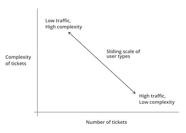
Speaking to traders on different desks, we found that they had differing requirements, but that these requirements could be simplified down into two main issues; complexity of information required on each trade, and the number of trades they made each day.
We found that each of the traders and their desks fitted on a scale, with some working on a larger number of tickets, but requiring less additional information to make the trades, and those who traded less tickets per day, but required more information to make their trades:
Graph showing the sliding scale of different user types, based upon complexity of tickets (amount of information shown on them) against “traffic” (number of tickets dealt with per day).
Traders didn’t make all their trades themselves
Traders oversaw the trading process, but required ways to easily discount tickets which were not relevant to them, or could be easily responded to. Therefore, we needed a way for traders to hide those less relevant tickets, but still be able to check back and retrace them if required.
Demonstrating value through discovery
Following my research, the Product Owner was keen to see some visual progress of my work, and I felt it was best to demonstrate the value of my efforts with ideating and testing assumptions through low-fidelity prototyping, which I could test with him, the Subject Matter Experts and Traders, in order to answer questions while showing progress.
Below are some of the concepts I experimented with:
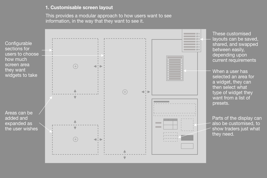
A customisable screen layout that allows users to prioritise information to their own needs, while ensuring that key data is not obscured.
Customisable screen layout
To overcome the issue of displaying tickets that overlap each other, we needed to revise the design in order to ensure that tickets could be shown and prioritised without obscuring key information.
I therefore designed a screen layout which users could adapt to their preferences, using the rule established above, showing prioritising components showing tickets, or supporting information, in a way that suited their own workflow.
Traders could set up the screen the way that they wanted, save them, and even share them with colleagues, as we found that many Traders would often copy from the one Trader who had taken the time to revise their set up.
Showing how users could not only change the size of tickets and the supporting information inside them, but also triage tickets to suit their own Trading style.
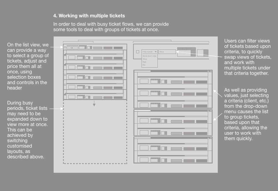
Working with tickets
Also following the trend that we had identified, we wanted Traders to be able to be able to customise the ways in which they viewed and worked with tickets within the tickets section of the app
We wanted tickets to be able to show either fewer large tickets onscreen at one time, to show more supporting information, or more smaller tickets with less supporting information, depending upon where their Trading style fitted on our trend line.
Traders could also arrange “triage”, setting criteria to sort tickets into ones that they dealt with themselves, or ones that they could get the application to deal with automatically (such as refusing tickets that were below a certain price, or changing settings to cope with high traffic periods).
To give the Traders more control, we built in the ability for them to check these automatic trades “under the hood”, ensuring that they could quickly check and see that things were going as they had planned.
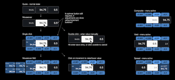
Concepts, black and white wireframes and colour UI exploring the concept of the overlay menu to increase or decrease prices incrementally.UI exploration around how the “daisy wheel” overlay could allow users to quickly and incrementally adjust bid prices without taking their hand off the mouse.
Improving functionality
As speed is the essence with RFQ trading, Traders expressed the need to be able to adjust bid prices quickly and precisely as a counter offer before returning them back for confirmation.
Observing the ways in which the Traders worked, we found that they relied on mouse input, and didn’t want to keep swapping back to the keyboard. It was because of this that we developed the “daisy wheel” approach, allowing users to quickly adjust big prices in set increments in a controlled way.
This also allowed us to show other prices, so the users could stay informed with adjusting their bid without having to look over at another side of the screen.
Atoms – showing the styling of smallest componentsMolecule components – showing how atoms fit together to make slightly larger componentsOrganism components, showing how the atoms and molecules fit together into larger components, such as ticketsPulling the whole thing together into a screen that highlights important information, triages tickets and provides background analytics
Creating a design system
As the sole designer on the team, I had to redesign numerous components, each of which had to be reviewed by stakeholders and tested with Traders.
This led to numerous revisions of components, which had knock-on effects to other elements within the user interface.
In order to reduce workload and maintain fidelity, I devised an atomic design system defining everything based upon a hierarchy:
Atoms (smallest possible items, such as buttons or labels)
Molecules (combinations of atoms, such as an input form)
Organisms (groups of molecules, such as a ticket)
This helped to define onscreen colours, information and messaging that didn’t fight for the user’s attention, and helped them to focus on what was most important.
Due to the modular nature of the design system, this also helped the Development team to produce a modular component system using Storybook, meaning that quick changes to the master would cascade down to code that had already been implemented.
“I really appreciate how much easier this is to use, it’s really helping me to do my job better”
Trader from the Bonds trading desk in Tokyo
Outcomes
From my efforts, the platform was proven to make trading faster and more effective, leading to a reduction in lost trades by 80%, and many traders reporting much better experiences with the platform.
The initial engagement only lasted three months before I was moved on to another project, but I was asked back later by the Product Owner for further work on the projects s I was “the only designer who understood the context”, which was quite a change from the skepticism he originally expressed in my design thinking process.
I was later asked to be part of a town hall interview at my consultancy, explaining the work that we did, and how we made it into a success. I also wrote an in-depth analysis of how and why you should conduct better user research in your projects, to help demonstrate to colleagues and clients why design should be considered at the start of the project, and how that can help to make highly successful outcomes.
If you’re interested in how I can help your complex project to be more successful, why not message me, and we can discuss your requirements?
Insight to impact: How user insights and team collaboration made a best-in-class scientific database
Introduction
With over a century worth of highly respected materials science journals, Springer (now Springer Nature) created Springer Materials, an online database for easier access by their audience of academic and corporate scientists worldwide. After several years online, Springer Materials was now suffering a decline in usage and renewed subscriptions. We wanted to understand the reasons for this decline, and explore ways in which we could create more value for customers to encourage them back.
Project Details
My role
Senior UX Designer (London)
Team
Technical and Business Product Owners (Heidelberg, Germany)
Junior UX Designer (Pune, India)
Business Analysts, Project Manager, 6 Developers (Pune, India)
Timeline
October 2014 – October 2016 (2 years)
Discovery
Recruiting users
One of the first hurdles we faced was the fact that the Product Owners had no contact with users, and so were unable to provide them for research. I therefore had to look up companies and institutions on LinkedIn, write to Heads of Departments and key individuals to request participation.
Part of a poster I created and sent to researched institutions and companies to encourage people to sign up for user research sessions
While this was a time-consuming process, I was able to get a good understanding of the types of user involved, and put together a group of users with whom I could conduct research and testing, as well as add and remove users depending upon availability. This ensured that I woudn’t have to repeat the recruitment process again, and also had a set of varying opinions and perspectives.
Planning the research
As I am not a materials Scientist, I worked with my Subject Matter Expert colleagues to understand the current state of the platform, and how it was used. This helped me to refine my research into four key stages to examine:
The four key stages around which I based my research: what brings the user to the database, how do they search for information, how do they work with the information they need, and how do they take it away. This not only worked for this project, but has become a useful model for quickly understanding future products.
Involving the team
As well as improving my own knowledge, it was important to help my product team understand the context behind decisions, and so in order to include them in research sessions, I would have them listen in to the call, and provide questions suggestions via Slack. This helped them to take part and foster empathy with the users, without interrupting the flow of the interview.
A remote user research call, with the call viewing the product on the main laptop screen. I have my written questions in front of me, and on the right is a Slack channel with my colleagues listening in. My team can ask me to ask questions to users on their behalf, to help their own understanding.
Major discoveries from the research
What brings the user to the site?
Users were often provided access to Springer Materials by their company or institution, and used it to look up data for their own research and experiments because of Springer’s reputation within scientific publishing.
However, they had found their experience in locating the data they needed to be frustrating and unclear, which they reported back to the people who bought the subscriptions, leading to a decline in renewals.
How do they search for the information?
The most common search terms were for a material and a property, such as ”steel melting point” or “mercury surface tension”.
However, users expressed frustration with the results they received, with searches not giving desired results. when they found what they wanted, they would have to click on multiple pages to actually locate the information they needed.
How do they work with the information they need?
As the site had been based upon scientific journals, when the users found the relevant page, they would then have to download a PDF with image scanned pages, which they would then search through by hand to obtain the data they need.
How do they take the information away?
As the data was image scanned, there was no way to digitally export it, and so users would have to print or write it out by hand, or type it into another application themselves.
Analysis: co-location
Our product team and stakeholders gathered at our Pune office for a week together to analyse the findings:
Presenting my research findings, I defined the key discoveries and provided personas to identify the needs of different user types.
I then organised sessions building empathy maps and user journeys to further explore the problems and identify what we knew against assumptions to be explored later.
We split into small groups, coming up with ideas that leveraged different expertise and viewpoints, which were presented back to the wider group for criticism and discussion.
This then helped us come up a with a series of concepts which we could build into prototypes to test with users and challenge assumptions.
Working with the Product owners and Business Analysts, we could then prioritise solutions on an Impact vs Effort matrix, which helped us to build a plan for the work, ensuring that we could demonstrate value quickly while also keeping larger pieces of work for later impact.
Presenting ideas during a collaboration session with team members
Solutions
Improving user journeys
The quickest way of demonstrating value to users was to make the process of finding a piece of information more easy, by reducing the number of steps involved,
We started by identifying “red routes”; key journeys that users took through the site to find information, such as finding a specific material such as “benzene”, and looking up a property such as “boiling point”
We identified in our research that the user journey had bloated due to “experience rot” (continual addition of extra pages and features outside the original remit that confuse the original objectives and impair user success).
Taking those key routes, we quickly mocked up clickable prototypes for users to try, ensuring that our assumptions met with their mental models, and gaining feedback before revising the actual database.
During this testing, we also identified opportunities such as digitising the data within the PDFs, which I could then advocate to the business as opportunities for future product development
User journey illustrating the five pages and one PDF, with their interaction points, that the user had to navigate to reach a required piece of information.I managed to boil this user journey down to a mere three pages, including the home page, search and details page (see digitised data below).
Making pages responsive
During our research, we identified not only the different requirements for each persona, but also discussed with them the different scenarios in which they would access the database. For example:
People accessing the site on a mobile device would often want to check a single, specific piece of data, and appreciated the ability to access the information quickly, without having functionality that they did not require at the time get in the way.
This also worked for people who would view the database on a smaller window on a desktop, ensuring that their view focussed upon the information that was key to their search
People who accessed the site while sat down, with a larger device such as a laptop or desktop, would want to spend more time investigating, and would want more supporting information
By returning to our “red routes”, we could then examine them with an extra dimension, ensuring that the layout and display for different device sizes responded to those requirements
Sketches showing how to adapt different parts of pages to different screen sizes. This allowed us to prioritise information around the different use cases for each form factor.
Improving search
A larger piece of work, we recognised that improving the results given in search would be more effort, but highly important in ensuring that users could find the information they required.
We asked users to take us through their search processes, and highlight where they saw results that they felt were not suitable to their queries.
We then reviewed with the developers, and discovered that it was the markLogic text-based search that was the problem, which only searched for text strings, and didn’t understand context.
We identified the key problem was that the simple case-agnostic text-based search was not suited to the nuance of certain search terms, for example:
“tin” refers to the metal; tin
“TiN” refers to the material Titanium Nitrate
As the search did not understand the context, typing either of those terms into the search would yield the same results.
We therefore explored a number of solutions, including:
case-sensitive searching, to understand specific chemical terms.
contextual drop-downs, to allow the user to specify which terms they were searching for
bringing in search database experts to implement a graph search, which created a contextual model between inputs (such as recognising tin as a metal, which would therefore have a link to steel, which is also a metal, but not tincture, which is a chemical process, but has the letters “tin” in it)
We built a solution that could analyse the different cases and chemical terms, as well as building a new graph search database, which would understand the relationships between different materials, such as metals, providing even richer search results.
This was then placed on a separate testing link, allowing us to test with users remotely, as well as in person, including taking it to various Chemistry Conferences in the USA, where we could conduct guerrilla testing with attendees, for a wider set of results.
Sketches to explore different methods of providing contextual search to the platform
“This is great. It really will save me a lot of time searching in the future.”
Corporate Researcher during testing at Materials Research Society Boston Conference 2016
Developing the homepage
As well as catering to the requirements of the scientists and researchers who used the platform, by examining the needs of the Buyer, we recognised that the homepage had three important roles:
To provide a starting point for users to explore the content
To update returning users with new developments
To demonstrate value for non-technical users such as Buyers
We therefore redesigned the homepage to include the following features:
A summary of the different types of content for new users to explore,
A timeline of latest additions and improvements to update returning users
Details of the depth of information and sources to demonstrate value for Buyers
These changes were added over time, to accommodate the work around supporting these features, and other efforts on the database.
Sketches to explore how content would adapt to different screen widthsBefore and after versions of the homepage, showing how we introduced clearer information and layout, browsing prompts and latest updates
Making data digital
One of the most fundamental solutions that we identified with the product, with the highest level of impact but also the greatest level of effort, was the fact that the data needed to be digitised. At the start of the project, data existed solely within the database as scanned-in pages from scientific books and journals, which frustrated users, and led to users feign that the product was not worth the subscription price.
it was this impact on subscription revenues that allowed me to petition Product Owners to organise a way of tackling this problem. Using the company’s relationship with client institutions, they were able to find a group of post-doctorate scientists to work through the scanned pages, performing specialist data entry to extract and annotate data for the graph search database, converting the scanned data into a fully digitised format. This work took about a year to complete, but this had a profound effect on the how we could make the product more valuable to users.
Surfacing results early
The digitised data meant that we could include it within search results, meaning that simple questions could be answered sooner, and demonstrating value more quickly. These could be displayed as search snippets, filled with simple answers, that led on to pages with more complex insights.
Sketch suggestion detailing the ways in which information could be surfaced early by providing simple details that inform users and lead them on to more in-depth information on subsequent pages
Working with data
We recognised that the majority users searched with the same pattern, namely a material (such as iron, benzene or carbon) and a property (such as boiling or melting point, band gap, or similar). By understanding this, we could use our newly digitised data to improve our offering:
When a user first searches for a material and property, then we can surface the simplest answer in the search snippet, as described above.
If the user wants more in-depth information, then they can click through to a page providing a dynamic graph, which uses the findings from scientific papers to plot data in a visual away, demonstrating the behaviour of the material and the property against a scale – for example, demonstrating how the boiling point of steel changes when submitted to different atmospheric pressures.
Alongside this graph, the results are also provided in a tabular format, which allows users to work with the data displayed in the graph. They can change criteria, expand or limit the dataset, all to ensure that they get the information they require for their purposes.
As the last part of the model we discovered, this data can then be exported into a range of format, such as visual images of the graph, or spreadsheets of the results, facilitating use in the user’s work.
“This is awesome. I don’t think anyone else is doing this. Where do I sign up to get it?”
Student Researcher during testing at American Chemistry Conference, Philadelphia 2016
Sketches exploring how details can be surfaced progressively, providing key information early, leading on to more customised detail later on. These concepts helped me to explore concepts and develop solutions with my team.My sketch and a screenshot of the results page – showing details of the behaviour of a property of a material that the user has searched for. The table below shows the information in numerical form for export and links for citations.
Outcomes
Our work reversed the customer attrition that the product was experiencing, and brought a 32% subscription increase from academic, corporate and other clients
Within two years, that extra revenue paid for all of our salaries and the money that the company had paid into the project.
Developing the digital data pages won accolades for the product as a “best in class” tool from the American Chemistry Society conference in 2016
In 2017, the Indian Government bought licences to provide the product in all libraries across their country
A site survey, run at the end of my tenure as UX design lead, showed that 69.2% classified the product as “great”, a 22% improvement on when I started.